Homeowners around the world choose the Scandinavian design style for their homes for a reason. Our compatriots will not stand aside, the popularity of this style is growing every day. Perhaps this is due to the fact that the nature of the Nordic countries is familiar to us in spirit, by temperament. Another possible reason for liking this style of designers and customers is due to the fact it has very much in common with the modern course of space designing. Nordic style is also simple, uncluttered, and has a very democratic view of the home arrangement, on the methods of its decoration. As well as a modern style, the Scandinavian style seeks practicality and functionality, performed in a simple but visually appealing cover. The deliberate demonstration of wealth, excessive decor, and flashy luxury are not about the Scandinavian people. Rather, it shows less than owners of an apartment or house could boast but will remain true to his principles – a convenient and comfortable environment can be simple and attractive. On the example of this two-bedroom apartment, we explore how the Scandinavian style is integrated into the design of the modern home.
Living Room
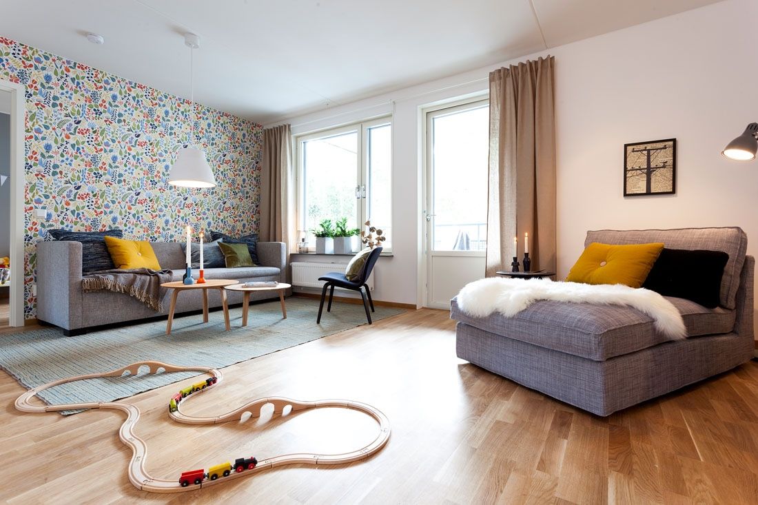
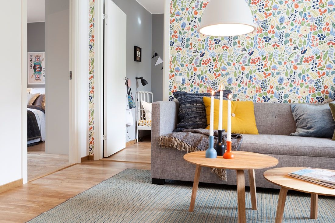
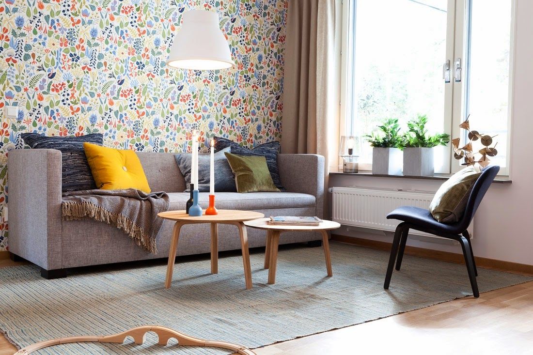
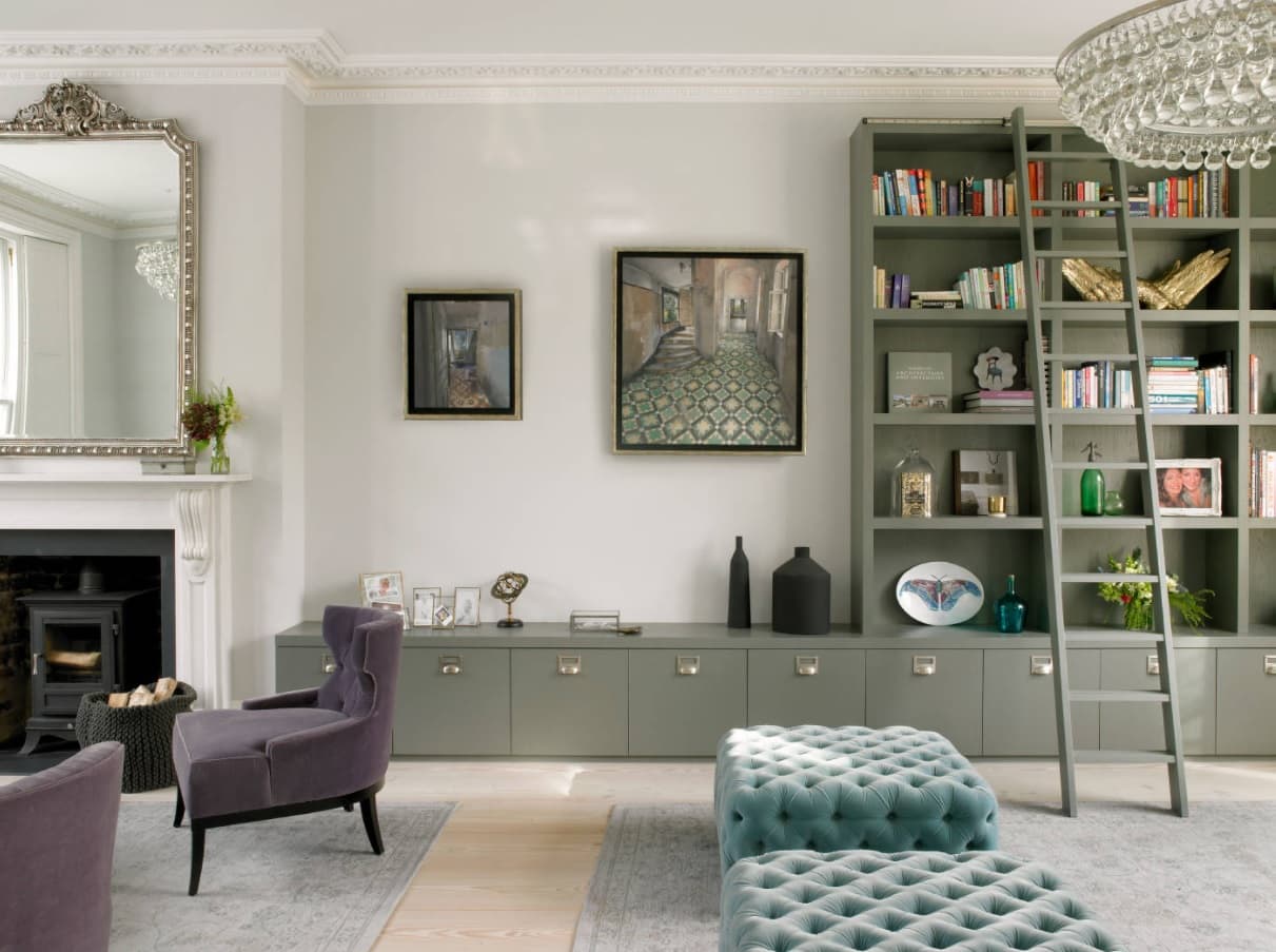
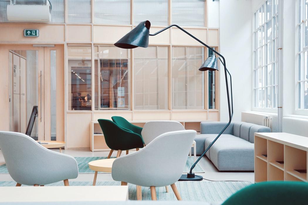
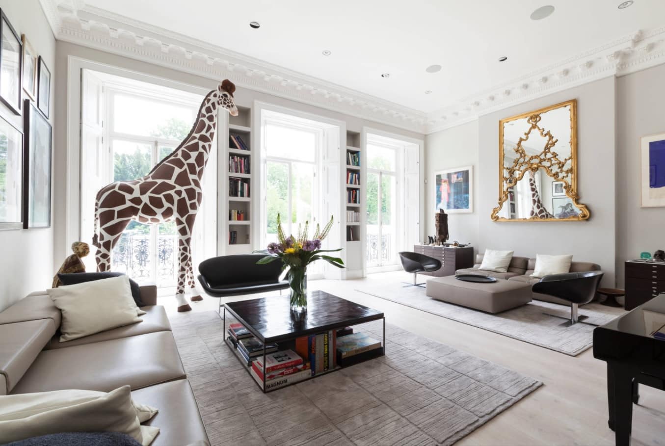
Scandinavian style – it is light and space. It is usually a cold palette of white walls with warm splashes of wooden surfaces and bright accents in textiles and decor. This principle is a base for the decoration of the living room. The exception to the common traditional decoration of the room surfaces became the use of wallpaper to create a colorful accent wall. Cold Scandinavian winter so lacking warmth and natural colors, the brightness of flowers and grass, fresh leaves, and young shoots. You can arrange a small spring directly in your apartment, using only a little bit of bright wallpaper.
Scandinavian style advocated the use of simple and concise furniture, comfort, and convenience in the operation and care are at the forefront. In selecting furniture for the living room the same principle has been applied – nothing superfluous, but not at the expense of the comfort of the households and their guests. Ergonomic models of practical colors look spectacular against the backdrop of the walls and create a harmonious atmosphere in the living room.
The short daylight hours pushing the inhabitants of Scandinavia, not only on the design of dwellings only in bright colors but also to use the maximum amount of natural light, which can only be obtained from nature. The rooms are decorated in Scandinavian style, do not have curtains on the windows at all, or window frames are draped with lightest translucent tulle, pervious to a lot of light. For cases where you need to isolate sunlight, there are natural fabric curtains, usually cotton or linen in natural, neutral tones.
The Kitchen-Dining Room
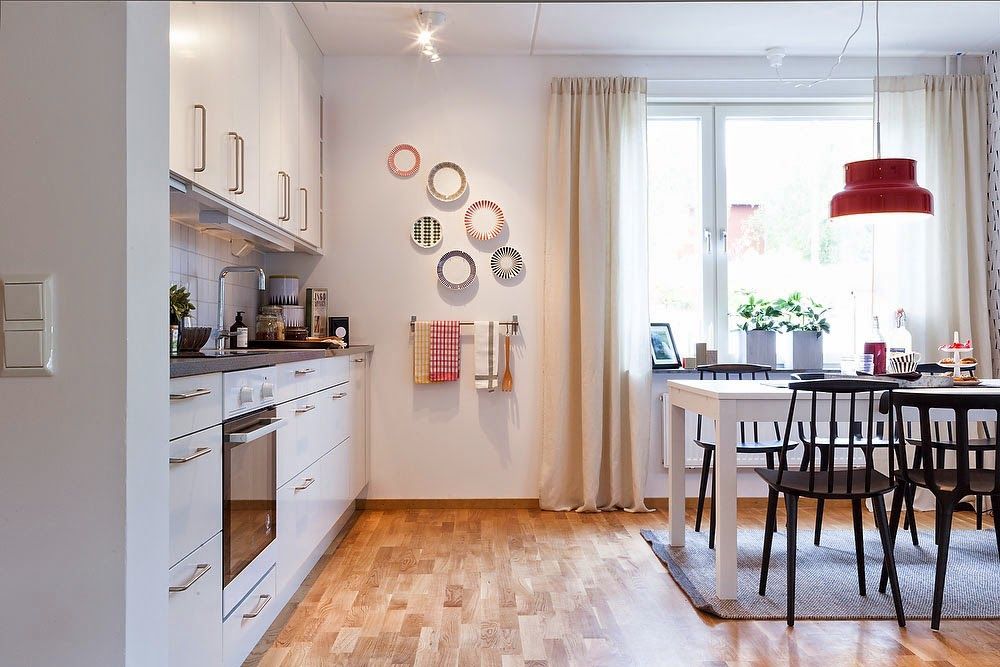
The kitchen space has also a lot of light and space. Nothing constrains passage, does not hinder the free movement of the room. The compact single-row layout of the kitchen unit allows you to create a sufficient amount of storage, work surfaces, and built-in appliances to carry out all the necessary processes on the one hand and leaving enough space for the installation of a full dining group on the other.
Black and white dining group became the basis for the zone of meals and entertaining of the whole family. The snow-white table and black chairs of different models, but all similar in modifications are reflected in the design of accent walls. Mottled black and white wallpaper pattern have refreshed a lot the interior of the function room. The spectacular finish of the dining area image became a bright chandelier hanging over the dining table.
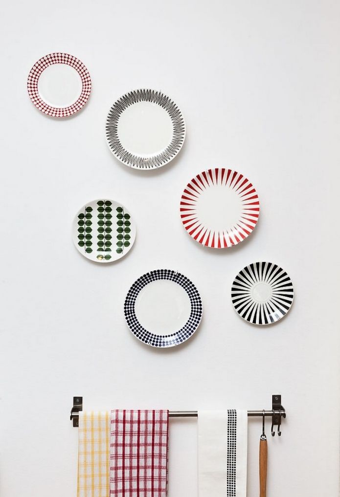
The snow-white walls of the kitchen have become an excellent background for bright wall decor. These are and a small collection of original plates, and drawings in the dark, and even the board for notes, recipes, or simply households` correspondence.
Two-Bedroom Apartment Scandinavian Style Design Review. Bedroom
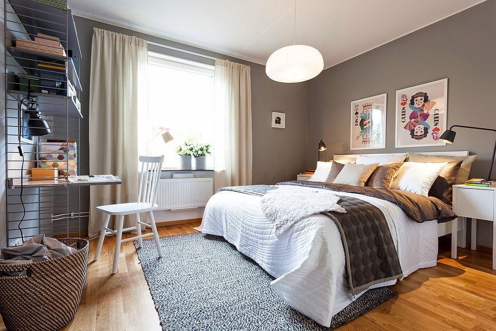
The space of the sleeping area allows stepping away from favorite Scandinavian wall decoration in white tones. Against the background of neutral gray, white bedroom furniture looks very impressive. Natural colors in the textile design of the bed and windows, a fun wall decor, and live plants organically variegate the color theme of the room. Combining a bedroom area with a functional mini-office segment was the efficient use of storage space. Storage in form of a lightweight rack and a small desk does not occupy much space and yet is a complete workstation for creating a mini home office.
Nursery
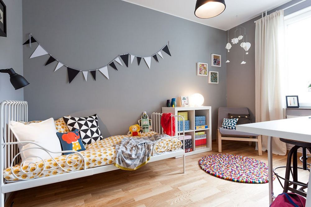
The very same combination of white ceiling and gray walls and laminate wood as flooring was used for surface finishing in the children’s room. Only at first glance, it may seem that gray is the wrong option for arranging the space for the child. After all, on a background of neutral color is particularly clearly visible white furniture and bright accents in textiles and decor, carpeted floors, and wall decorations.

