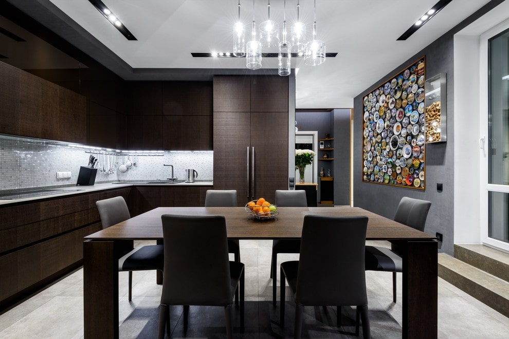
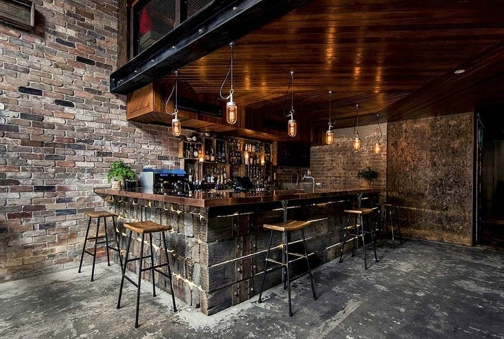
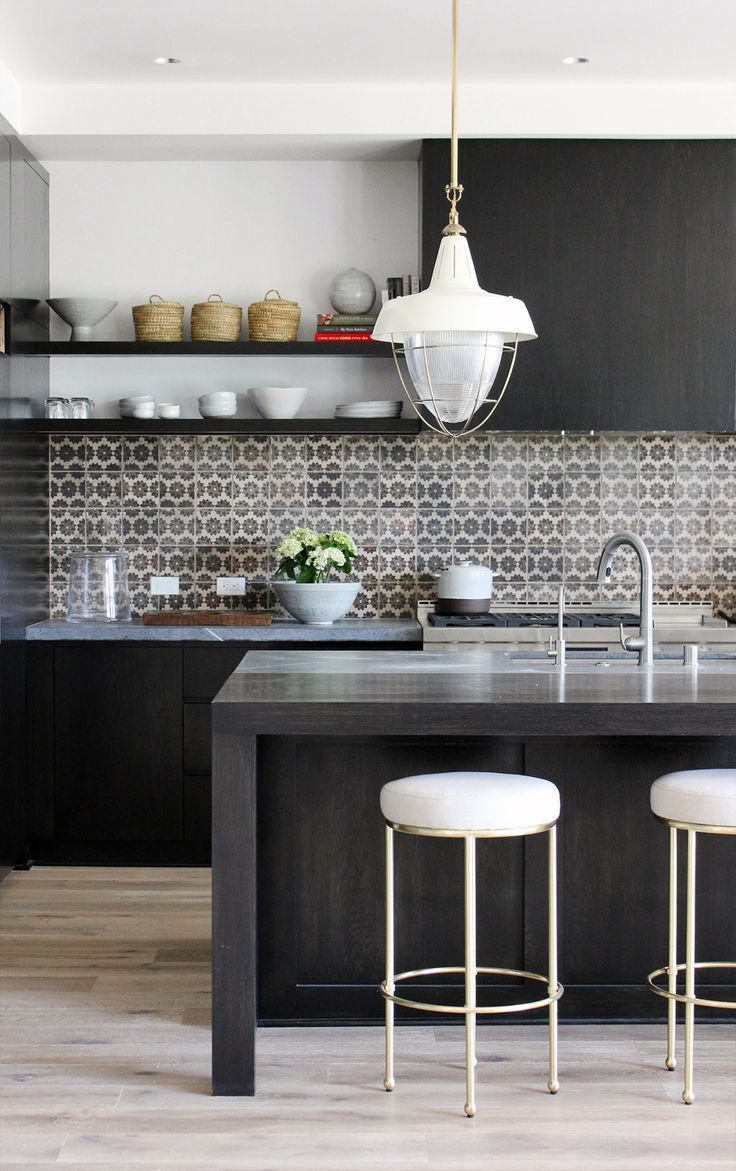
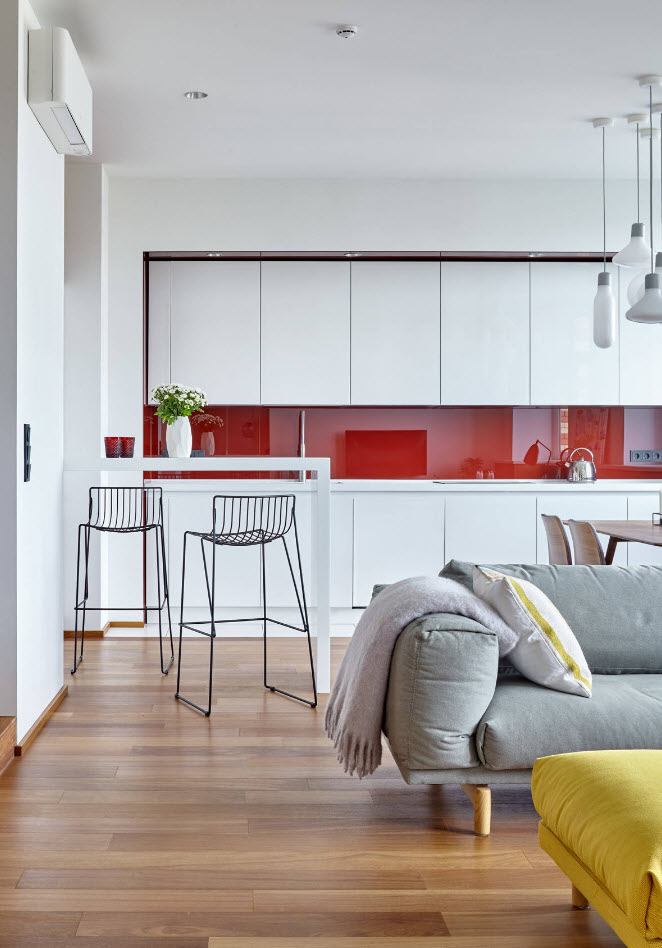
When planning and arranging a kitchen, people often make mistakes that negatively affect the comfort and functionality of the interior. Although it may seem that kitchen design is a simple task, it is worth remembering about a few important steps taken in its arrangement. What omissions occur most often and how to avoid them? What should I look for before creating a completely new kitchen? Let’s now review top 10 most popular mistakes when designing a kitchen and see some tips to avoid the simplest ones.
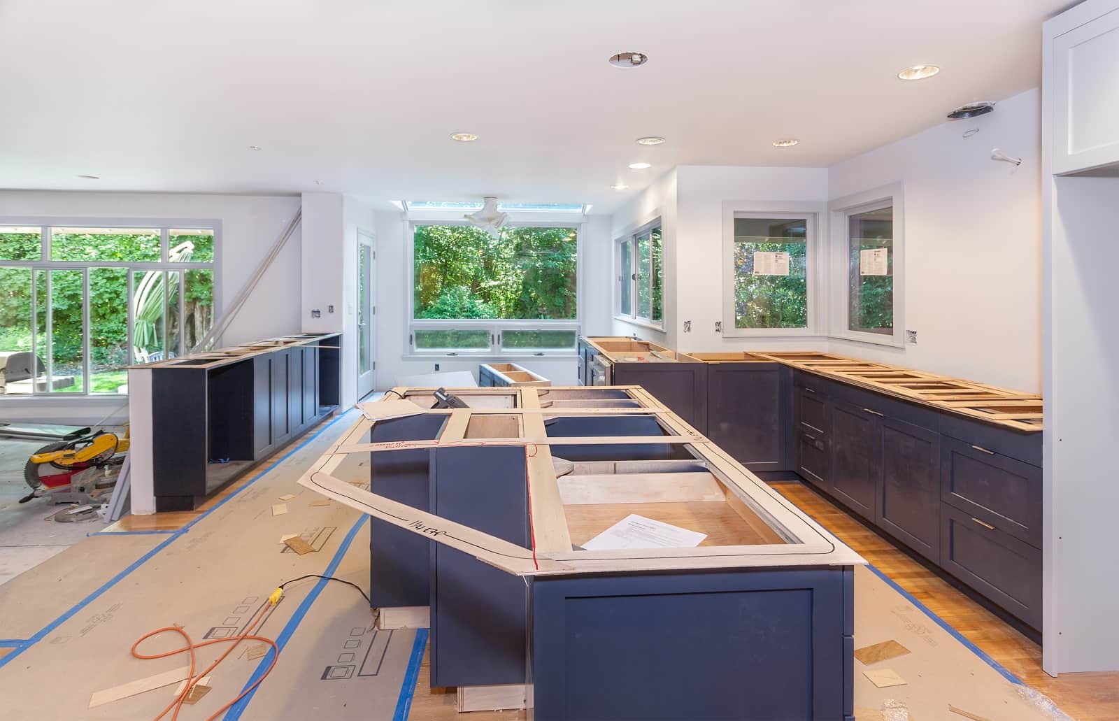
The Lack of a Clear Budget and Kitchen Planning Can be a Major Mistake in Renovation
The first and most important step in carrying out renovation is the precise definition of the budget for repair and its project. Knowing the limits of your capabilities, you can easily choose the right materials and equipment that you will use.
Another important point is to adhere to the principles of kitchen ergonomics. The person designing the kitchen should not forget about the details that can cause discontent and nervousness during everyday kitchen activities. First of all, functionality is important, as well as a properly chosen aesthetics, adapted to your lifestyle.
It is worth paying attention to things that seem obvious at first glance:
- the correct height of the surface of the tabletop;
- correctly selected distance between kitchen utensils;
- aesthetics of general design;
- lighting;
- colors of furniture facades and walls.
No Division into Zones
Each kitchen space should contain 5 main areas:
- stocks;
- storage;
- the washing up;
- food preparation;
- cooking food.
The Principle of the Working Triangle is not Abided
Zones must follow each other – in the case of right-handed person we go clockwise, and for left-handed person – in the reverse alignment. In addition, distances and the so-called work triangle are important, that is, the corresponding distance from:
- fridge;
- sink;
- oven.
In order for a kitchen to be fully functional, the distance between devices in the so-called kitchen triangle should not exceed:
- from refrigerator to kitchen sink 120-210 cm;
- from the kitchen sink to the oven 120-210 cm;
- from the oven to the refrigerator 120-270 cm.
Remember! Too small distances between the stove and sink, as well as between the sink and refrigerator, are very inconvenient. On the other hand, the problem may be in too large distances. It can be tiring to cover “kilometers” between the refrigerator, oven and sink.
Wrong Height of Kitchen Furniture
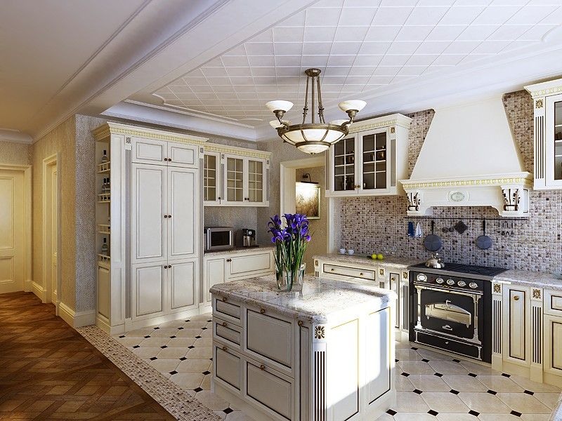
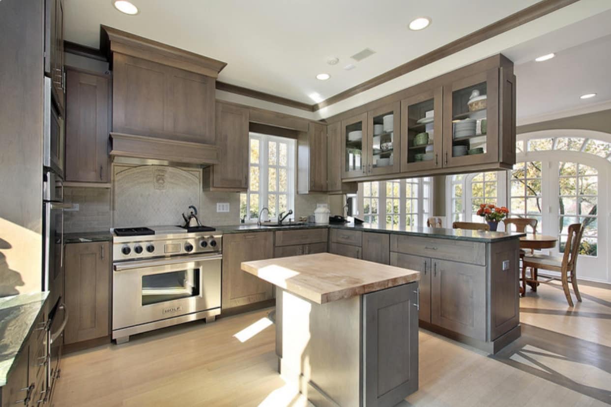
Kitchen island is an effective solution for large rooms. On either side of the sink, work surfaces should be provided on which products or ready meals will be stored. The height of the tabletops, their respective area and equipment placement are also very important.
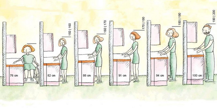
Tip! The height of kitchen furniture (up to the tabletop) should be adapted to your height, that is, 10-15 cm below the elbow height, with a tolerance of a couple of centimeters, when several people use the kitchen.
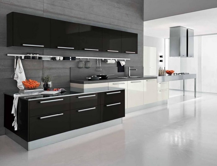
The Use of Single Row Layout
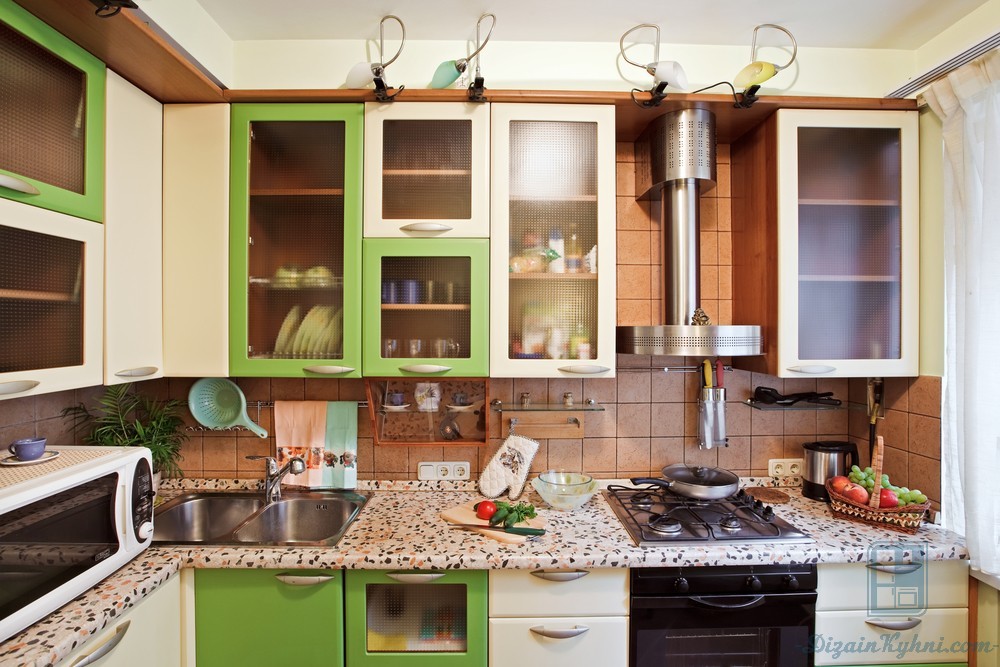
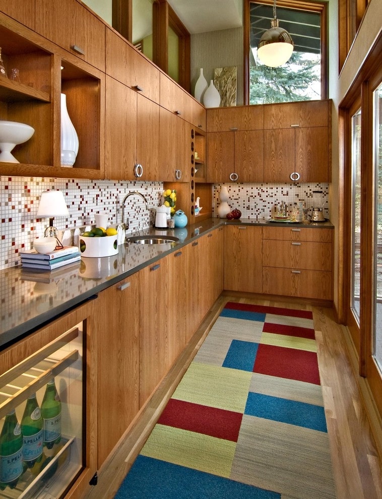
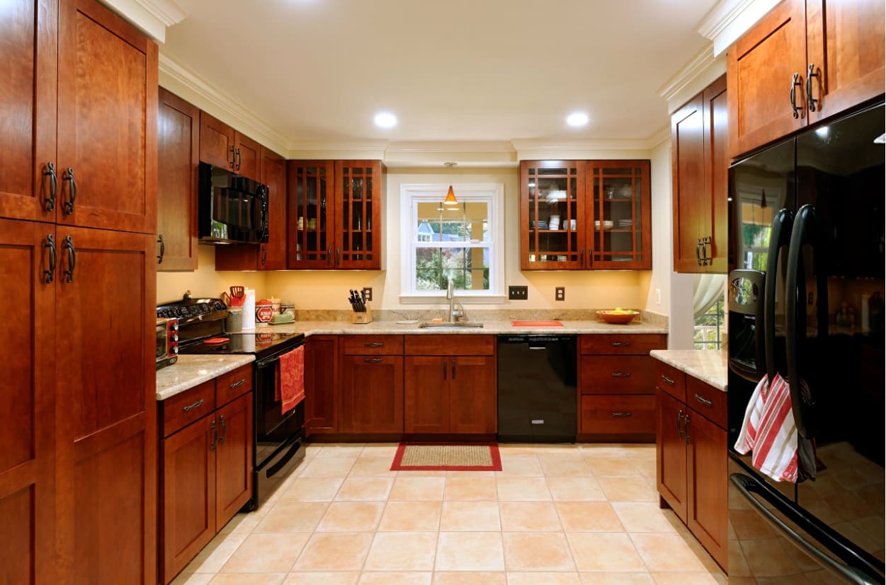
Many designers consider a single-row layout a mistake, because the client needs to overcome long distances. This layout can’t follow kitchen triangle rule, which primarily impairs the functionality of the space. Although, maintaining suitable distances between equipment makes work much easier in some cases.
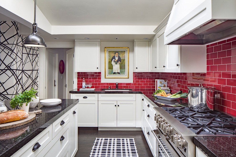
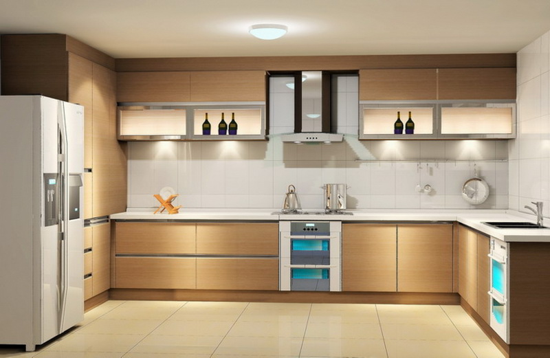
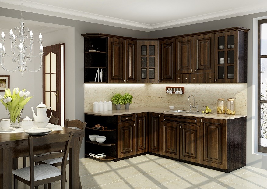
Tip! The most convenient kitchen layout is one that takes the form of a letter U, L or G.
Incorrectly Configured Appliances
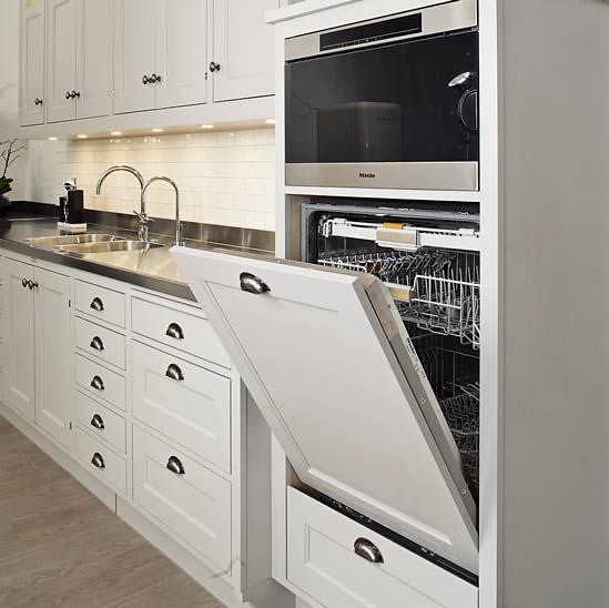
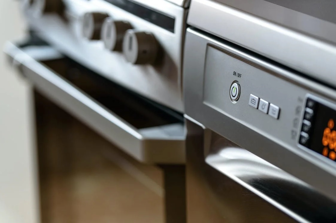
Installing an oven or even a microwave above the dishwasher is a terrible idea. Water vapor rising from a dishwasher will damage the equipment mentioned above and will void your warranty.
Poor Storage Arrangement
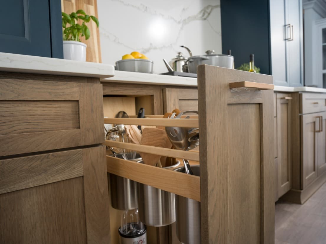
Each element, whether it is equipment, food or dishes, should take place in the kitchen which has convenient access. This will help maintain order and improve use of the kitchen. The special care should be taken of the practicality of cabinets. First of all, you should remove objects from the surface, which take away valuable useful centimeters and violate harmony.
Tip! “Horizontal planning” is very important in the proper design of the kitchen. Things that are used less frequently are worth putting to the wall cabinets at the height. The same applies to the lowest cabinets. Appropriate equipment configuration saves you from unnecessary movements and searching for items that are at hand.
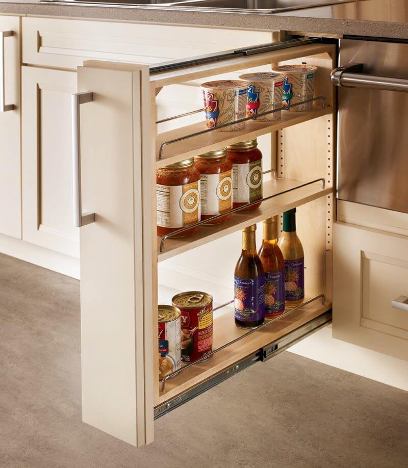
Cabinets, located in the corners, due to the problem layout, should have a well-chosen internal system, due to which it is easy to remove objects from the visibility. Shelves can be placed in narrow areas of the cabinet, thanks to which you can hide bottles and jars.
Insufficient Lighting
This applies to both natural and artificial lighting. The work of the kitchen requires a proper light to facilitate the implementation of daily duties. Think of the correct arrangement of the lighting: it will not do without an upper lamp illuminating the entire room, and a point device for certain areas.
Good lighting is very important in the kitchen. The main light should not be too intense. You should choose lamps of sufficiently warm color. Work surfaces should be illuminated by an additional source. It is worth using various types of fluorescent lamps or LED lamps, which are ideal for installation directly above the worktops.
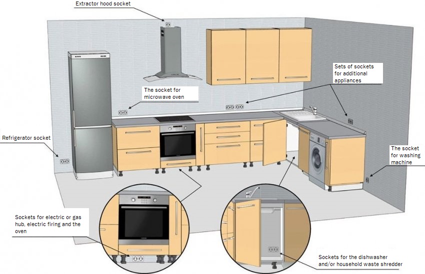
Few Sockets or Sockets Located in Uncomfortable Places.
When planning the placement of sockets, you must remember what number of household appliances in the kitchen must be connected to electricity. Be aware that sockets are designed for large appliances, such as a refrigerator, oven, or dishwasher, but also for small household appliances at the tabletop —coffee machine, kettle or toaster.
Use of Impractical Material in the Finish
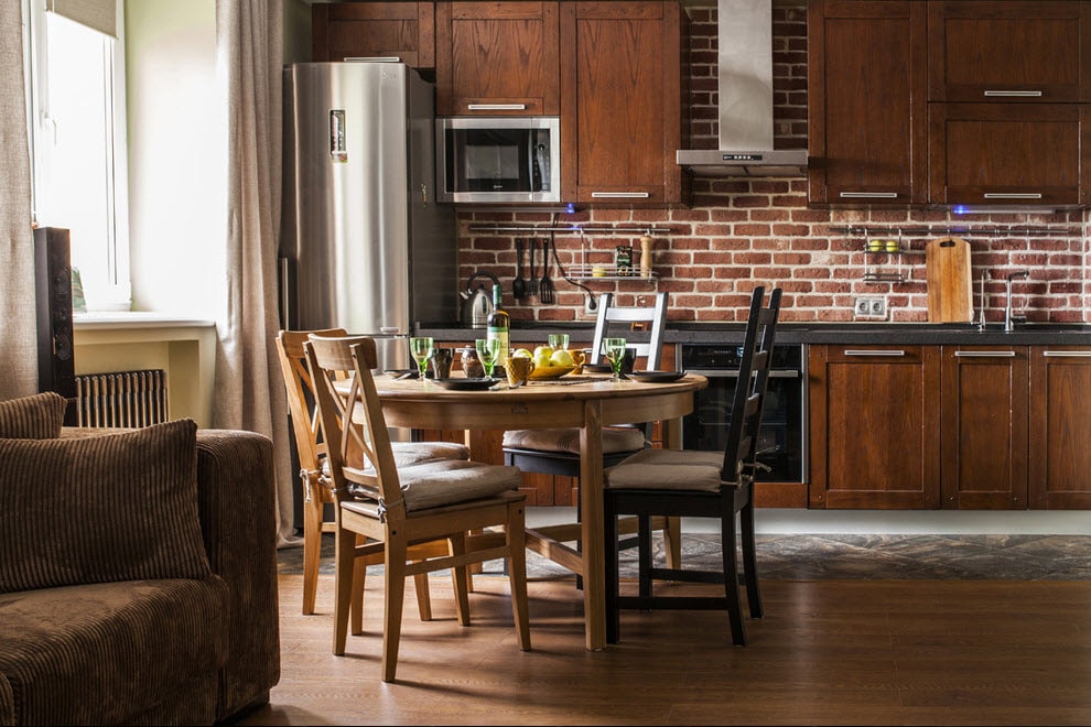
When planning a new home or furnishing an apartment, you cannot think about the kitchen at the very end. Any distribution of electronics or plumbing, as well as the appropriate design of the walls, floor and ceiling can affect the functionality and practicality of your kitchen. For example, wooden floors are not very suitable for this room. It is better to use tile or linoleum here.
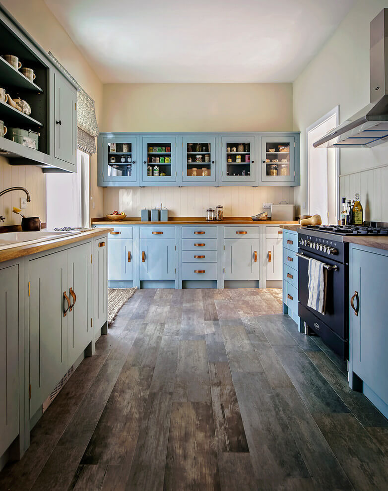
The kitchen is, first of all, a utility room, so the choice of materials and furniture should be determined mainly by practical values and functionality. This, of course, does not mean that you should abandon the seemingly impractical elements. For example, a wooden work surface (butcher block) can be an excellent solution. It is simply enough to maintain and protect it from fast wear. You also need to remember that a kitchen is a complicated room, and some materials or equipment just won’t just fit it.

