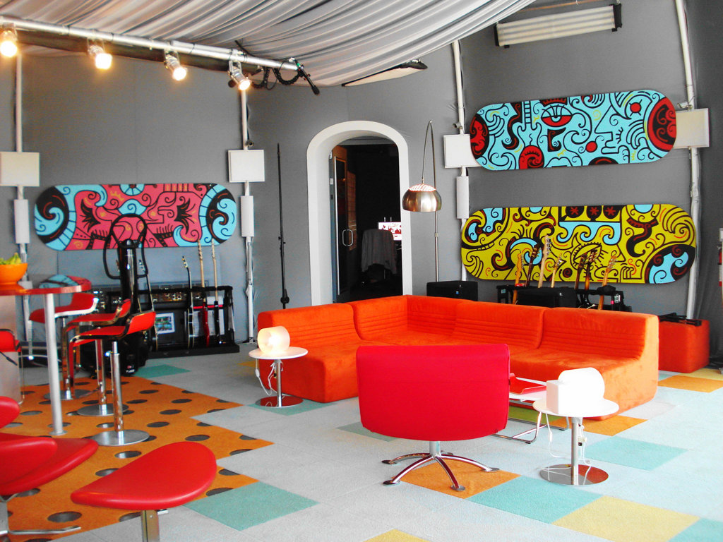
Pop art interior design style is very emotional and energetic, so it is particularly close to young people who are ready to live in perpetual motion. Even from the fact that just the name of this style of art, including interior design, can be understood as “hacking cotton”, follows that its goal is to surprise, to drive into a light shock.
Bright colors of pop art are intended to remind the windows of supermarkets that sell everything that can be used in the interior. Images of popular consumer products are presented as works of art, your house is intended to be a bright wrap of the everyday life taking place here.
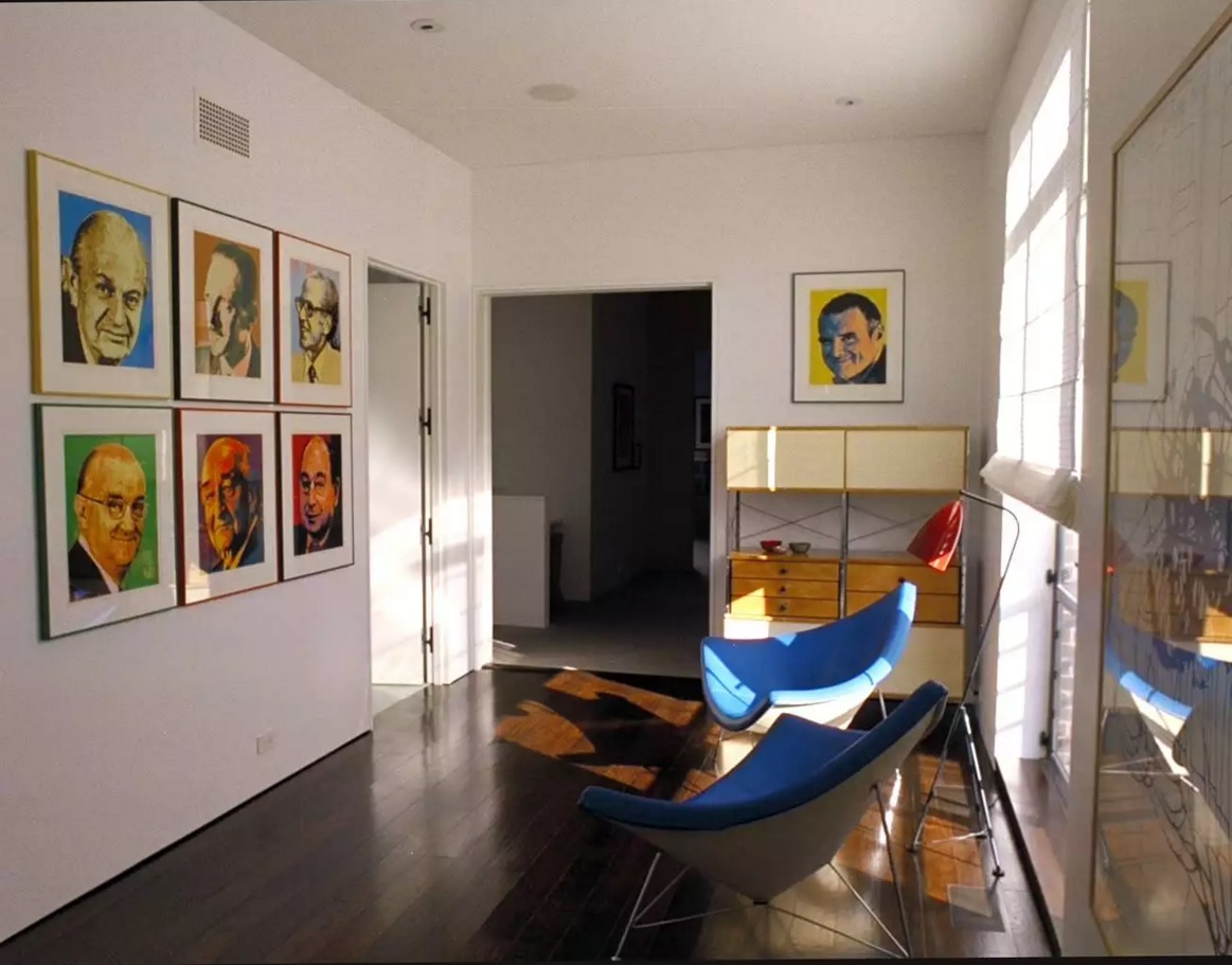
We should not forget that a considerable part of this style was established after the works of Andy Warhol, namely his bright pictures which became an indispensable attribute of any modern pop art interior.
Pop Art Interior Design Style. Life in the Rainbow
Bright colorful interior exhibitions are made of plastic, synthetic fibers, functional objects of catchy form, repetitive accessories, posters, and inexpensive popular souvenirs such as the plush heart.
- Identical items of different sizes are placed at different levels.
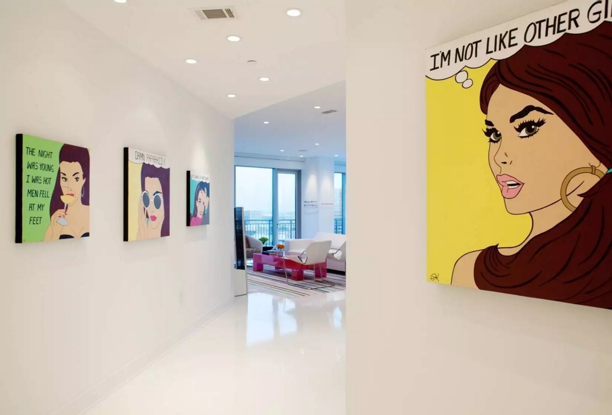
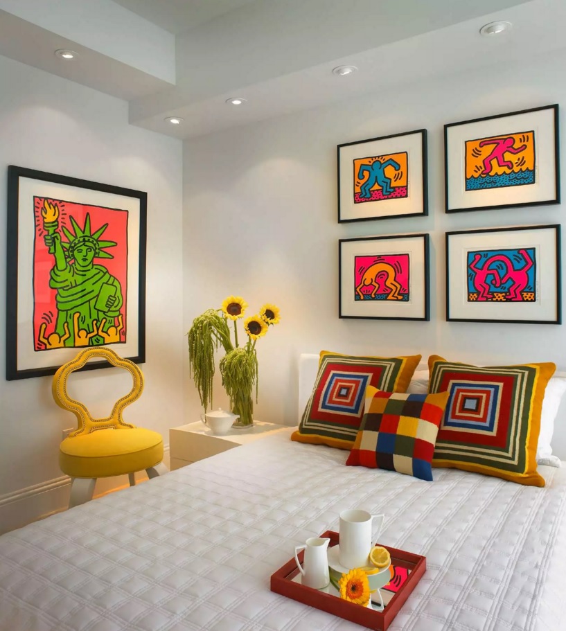
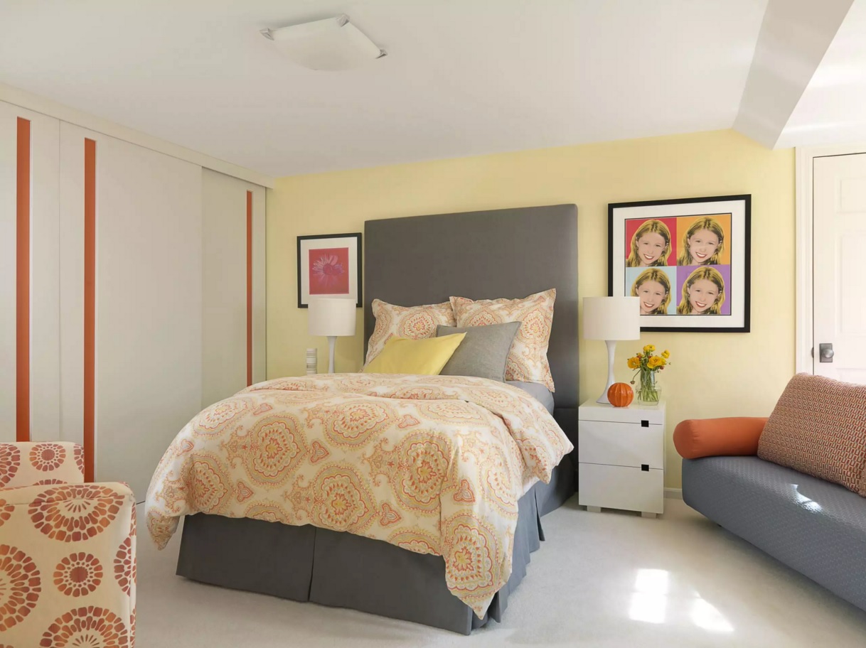
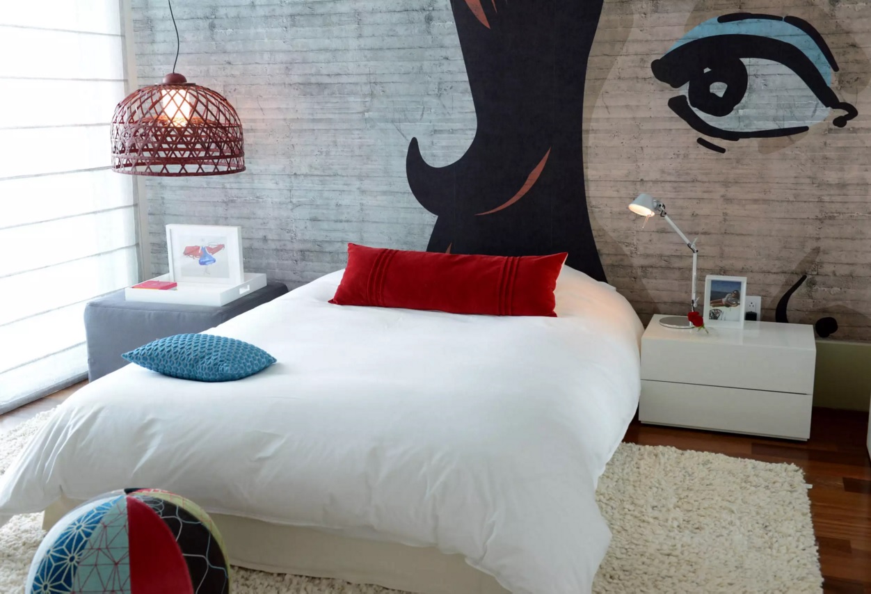
- large print or photo on the glass with a recognizable image can be placed in the center of the space: portraits of religious figures or products (a portrait of Che Guevara or advertising of Coca-Cola in the bedroom above the headboard perfectly match the style preferences).
- Carpets with the logo of a well-known company or expressly synthetic animal skins, wall tiles with the repeating and recognizable patterns.
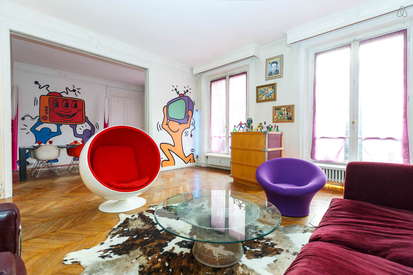
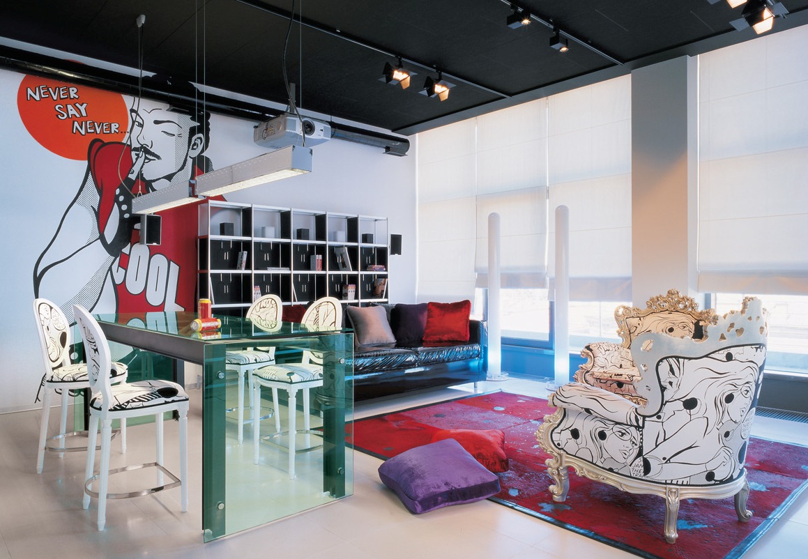
- Furniture – bright colors, with a catchy pattern, perhaps – with glossy surfaces or plastic.
Pop Art. Emphasized Artificiality
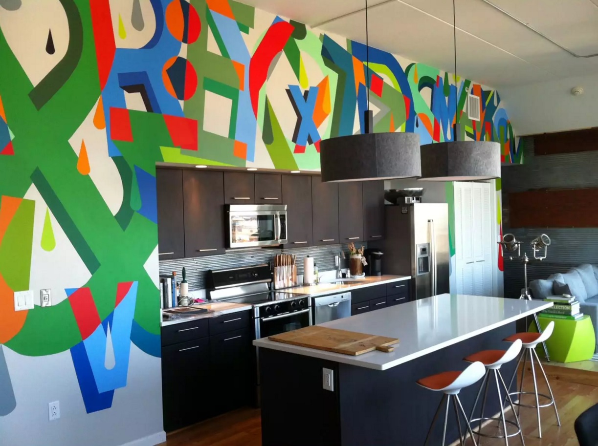
The walls, ceiling, and floor do not carry background notional load visually, they may merge into one decoration conceived by the artist. The pop art style in the interior allows acid colors that blend with the white, contrasting items together at the same time. A sense of proportion is determined only by your ability for a long staying in such screaming scenery.
- Optimum division of the walls by color is when one wall remains cream or beige, and it accommodates the mirror of unusual shape or stylized print, the other two are painted in bright tones, but in tune with each other, the fourth – the one that includes a door or window – in simple ornamental technology.
- The ceiling can be multileveled and asymmetrical with colorful lighting as well as to have a glossy plane surface.
- The floor is the most neutral part of the composition. But you can possibly meet a bright carpet (or restrained color with a chaotic pattern) here.
- The furniture amount is minimal. However, it has futuristic, unusual shape, squat, and deserving special reviewing.
- The wardrobe is replaced by a podium with drawers and cupboards.
- Accessories are plastic, chrome, but always of amusing form. For example in the form of a female silhouette or comic book heroes.
“Ridiculous” things and compositions are a prerequisite of Pop Art in the interior. However, they should not pretend to be elite and the more serious perception of them.

