This article was written by practical designer Natalia Preobrazhenskaya is one of the most popular at houzz.ru and represents the top 8 creative design tips on occupying the empty wall for any type of home.
Contents:
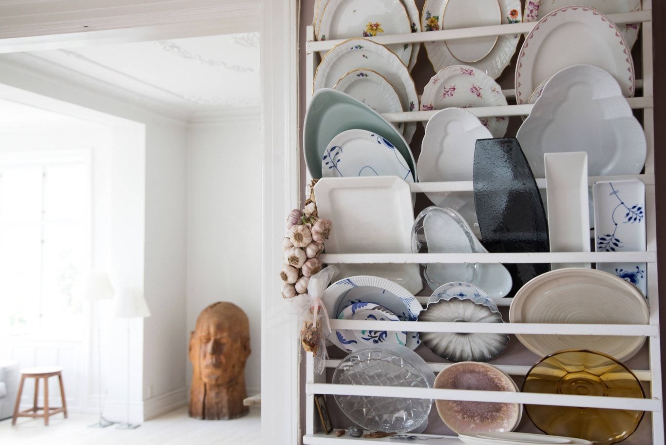
- Wall with plates
- Toilet decorations
- Chalkboard
- Small partitions
- Door decorations
- Creative radiator
- Curtains
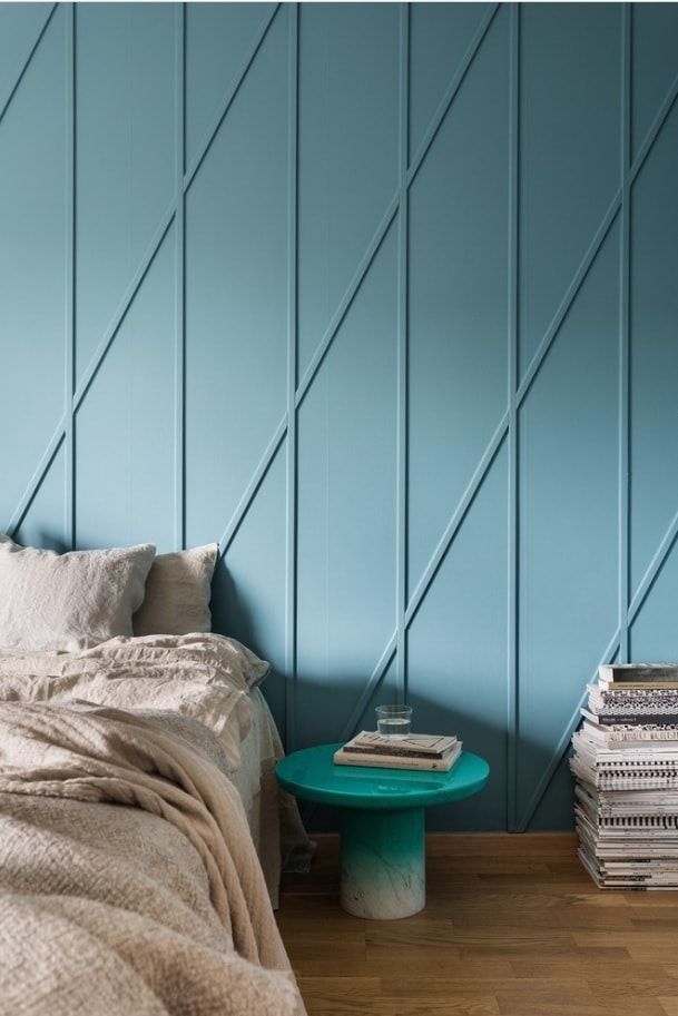
- Plinth, rail, molding
It would seem that everything is simple: on an empty wall in the living room, you need to hang a picture or a poster. Or probably a few photo frames for the composition. So it is, but not always. Sometimes it’s better not to hang anything, than “Audrey with a cigar”, “a can of soup” or “Merlin’s dress” once more. What to replace the usual decorative moves with, so that it was not so … straightforward? – We reveal some tips on how to make an unusual design of the bathroom, the decor of the kitchen, and other premises of the apartment.
I am very impressed by the decoration of the kitchen corner with wooden cutting boards or plates: they can be placed on shelves or rails. The cooking will be much more pleasant at times, and nothing will get in the way. But it is desirable that any subject is functional in a small kitchen.
Actually, is it necessary to hang decorative plates matched by the ornaments on the wall? Would not it be fairer to get and place “at hand” those dishes of all colors that you use only “on holidays”? Look at this Danish kitchen: in the creative mess on the shelf, there is a certain and very honest charm. And the plates are not just decor for the house – they are clearly used for their intended purpose.
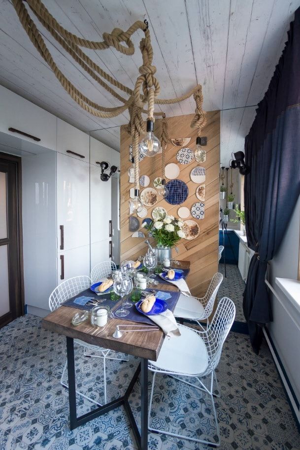
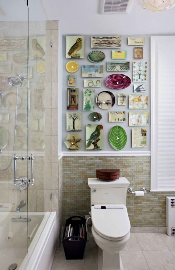
The reverse option: if you just want plates to be decorative only – deprive them of functionality. One of the fashionable tricks is to “cut off” the edge of the plate when assembling it into a rectangular panel, as was done in the kitchen design in the photo below.
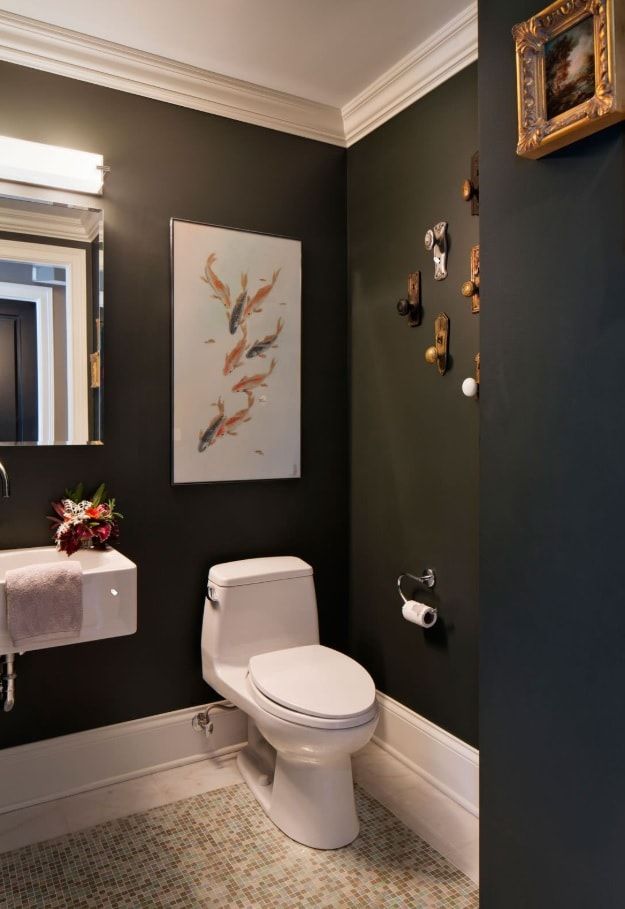
More than the modest size of a standard toilet even combined with a bathroom make you puzzle over fitting everything you need. Beginning the renovation of a small toilet, a family with children is looking for additional storage space, thinking out the functionality. Usually, nobody thinks of the layout and the decor of the toilet (especially the creative ones). But this does not mean that you should avoid decoration in the bathroom.
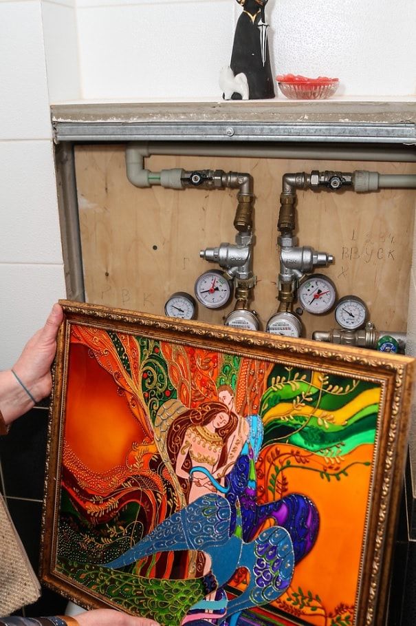
An unusual decor can be a poster that masks a plumbing hatch, or mosaic tile above the toilet. This will make the toilet space definitely more “living” and cozy. However, this is not some poster or some picture that “blocks the hole on the wall”. Unusual toilet design requires planning space with an eye to the fact that the hatch will be designed in this way.
Look at the photo: the designer coped with the task of decorating the wall thanks to the decor of the door handles and the poster against the background of monochrome walls. As a result, the design of this toilet looks unusual and very elegant.
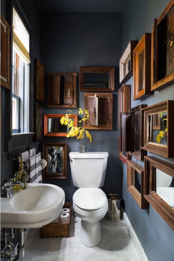
And here, and above all, a guest bathroom is an exhibition of mirrors: the idea is extremely simple, but it looks incredibly spectacular.
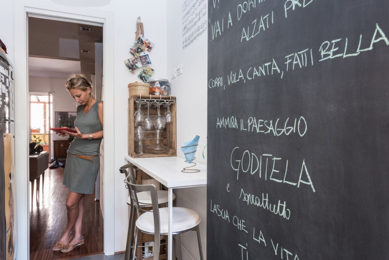
The record board is certainly useful in the kitchen or in the hallway. But there is one possible trouble: just the kitchens and hallways in our apartments have such size, that two people can hardly fit. So the risk of staining your clothes with chalky patterns is great. Especially if an empty wall for notes is a passing one.
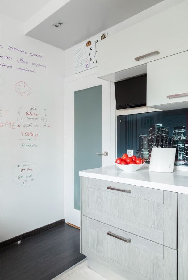
Therefore, the chalkboard (if it is so nice to you) should be sent to the refrigerator or the end of the furniture cabinet. And the wall on the passage should be decorated with other paint. I’m talking about the paint for records with a permanent marker (usually the base is white). It’s not such a worn-out move as a chalkboard. And if you paint it a wall behind the closing door, we get unusual decor, completely safe for everyone entering the kitchen.
Any apartment or house has such “bottlenecks” in abundance. For example, “narrow walls” are located between the windows in the living room, separate bathrooms, the door, and window openings. Of course, you can leave these partitions empty. However, in my opinion, in such cases, space seems more reserved and detached.
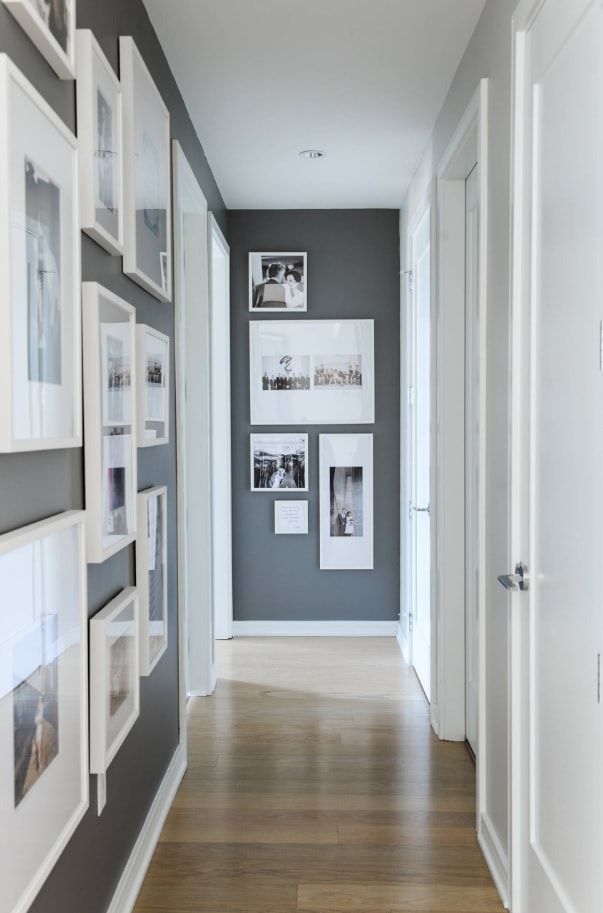
Tip: When decorating the walls of the house, owners often hang frames only “at the eye level” (who will contemplate at the knee-level, indeed). But from the point of view of space decoration, this is an incorrect line of thought. So, if you want to decorate a partition, take up the entire partition – from floor to ceiling.
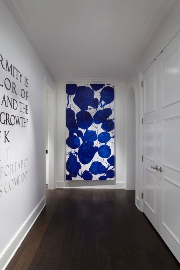
Look at the successful decorative option on the photo – there is nothing superfluous in this corridor, but the end of the wall (the partition) is highlighted with a bright panel. This solution allowed not only to decorate the picture itself but also to subordinate the geometry of the room, making it more “square”.
Fact: In the role of panels can act any cut of bright fabric, stretched on the stretcher.
And here’s another creative option for decorating the partition – a roll of wallpaper on … a hanger with clips. Bored? Remove it and hang a new cut.
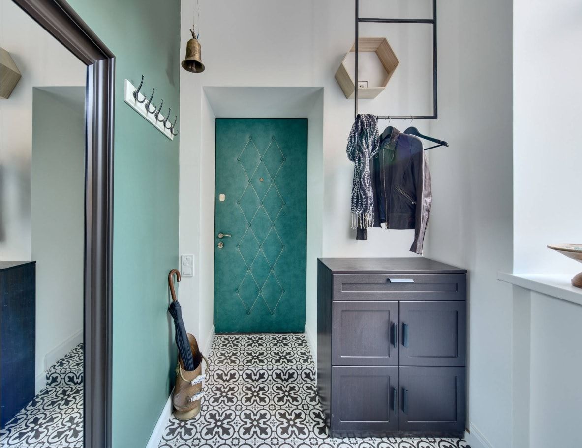
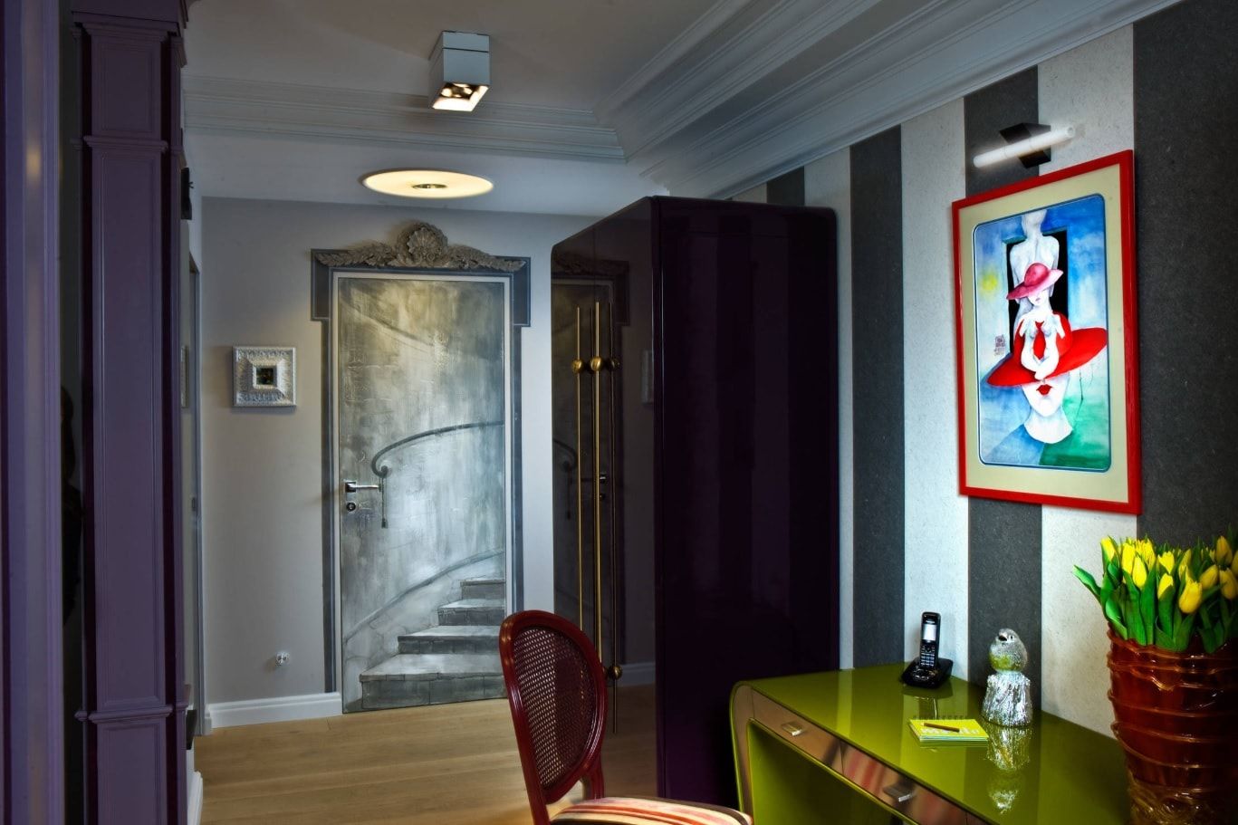
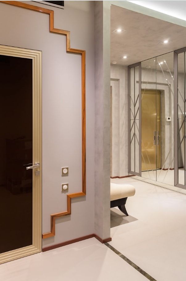
Try to paint the door and make it the object of the house decor. Choose contrast or, on the contrary, the same color as the walls. You can decorate not a door leaf, but only platbands – this technique will also allow you to perceive the geometry of the hallway differently.
You can literally turn the door into an art canvas.
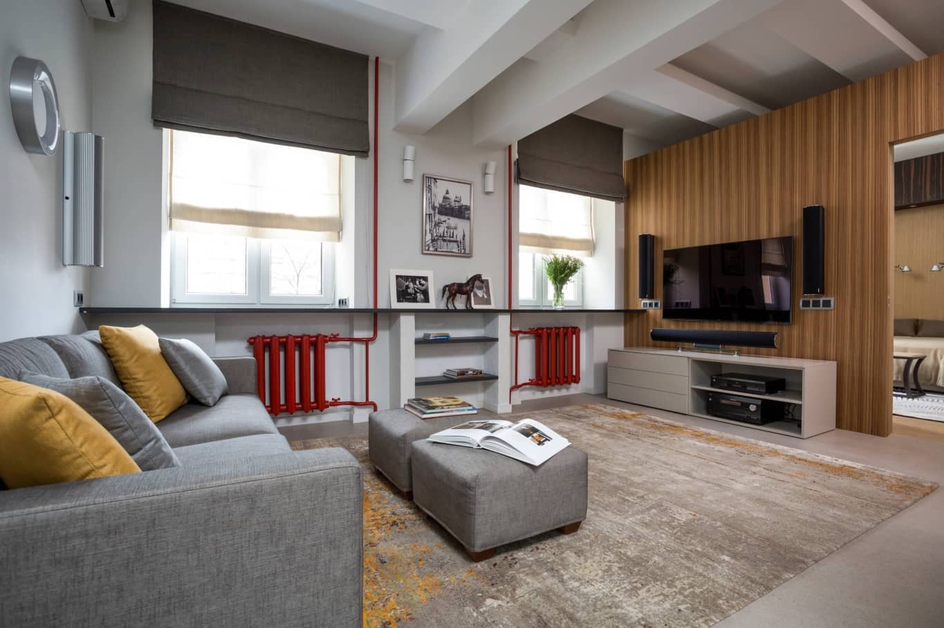
In most cases, it has a very ordinary appearance, which, we are honest, spoils the whole impression of the interior of the house. You can turn a flaw into dignity and draw all the attention to the radiators and pipes – for example, paint them in a juicy color.
The antipode solution is to choose a paint for the radiator tone to tone with a wall or with window frames: in both cases, you somehow disguise an unsightly heater.
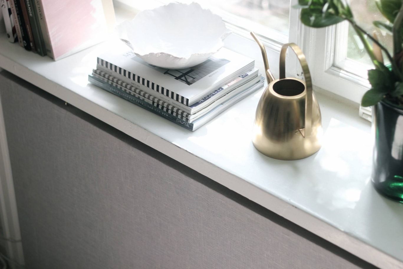
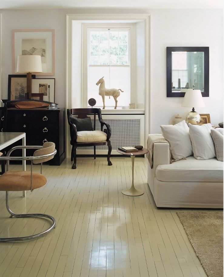
Another solution to the “radiator problem” is the installation of decorative screens made of MDF or plywood with special holes for the free circulation of airflows. Such screen-overlays are mounted under the windowsill, almost completely closing the radiator and being simultaneously an ornament of the window ensemble. Try to imagine the living room in the photo without a screen on the radiator.
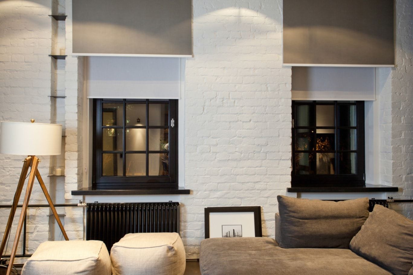
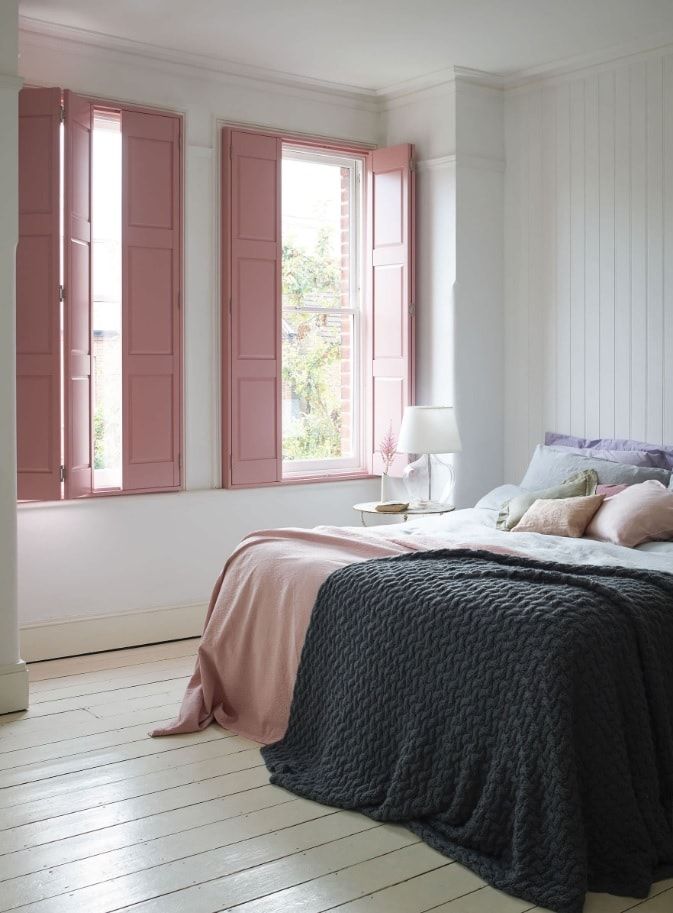
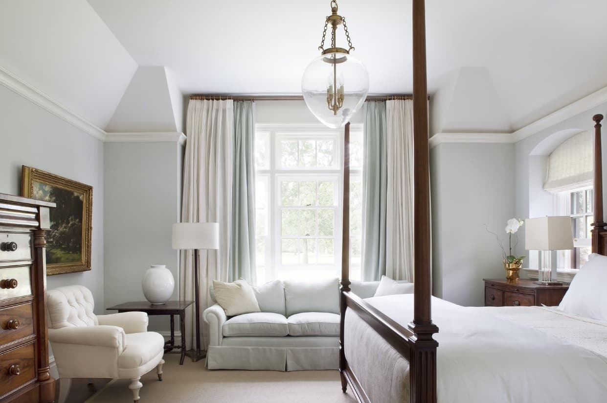
If the side is sunny, the floor is low or the house next door is closed – the curtains are indispensable. More precisely speaking, we will need to shut the window. However, you can do this not only with curtains. Why not try the interior shutters, as the authors of this Swedish interior did. The decor is not only beautiful but also very practical.
Return to the previous photo and look at the window carefully: how gracefully look at the window slopes, decorated with a decorative skirting board.
There are many spectacular decisions “for a dime.” Some look simple, some look at a million. But one can not be taken away: they are coping well with the task of occupying an empty wall. No worse than the pictures and posters from which we started the article.
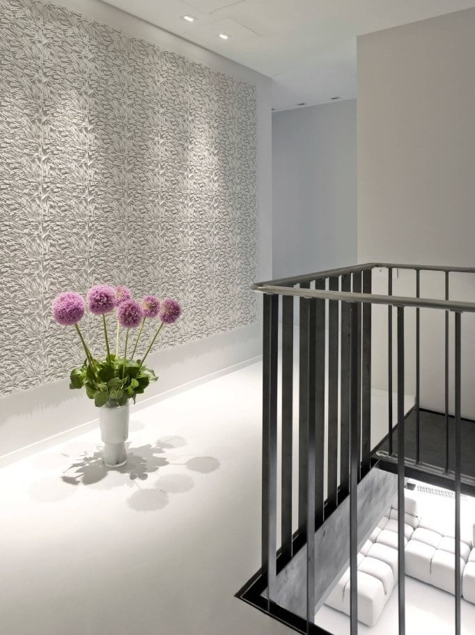
Rails can be distinguished against the wall, as in the example above. Or paste them on top of the wallpaper (take a look at the photo shows the borders of the wallpaper stripes) and paint it in one tone lighter – the wall will look “expensive” and effective.
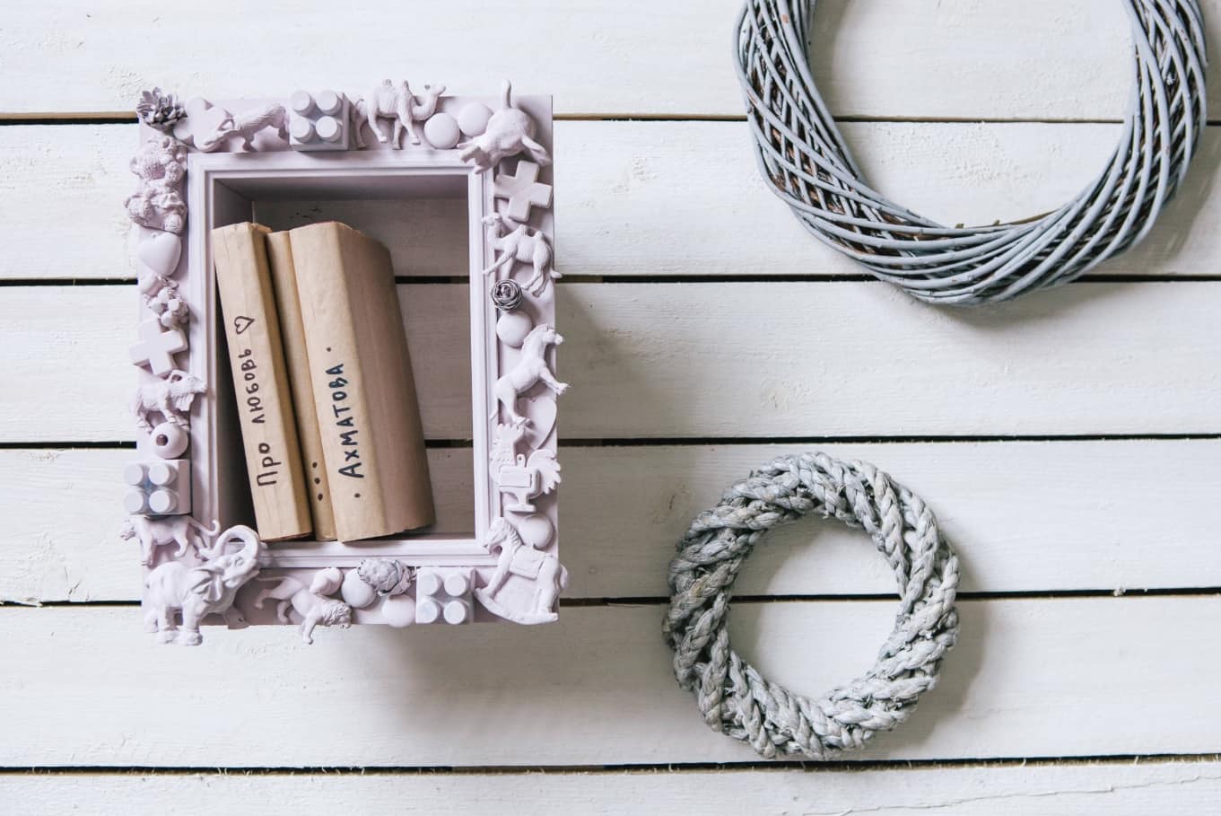
If you develop this idea, you can roll anything in one tone: even clothes clothespins, like on a wall in this staircase, like little animals from a children’s set of plastic dinosaurs (pictured above) and get a very unusual decor of the apartment.


