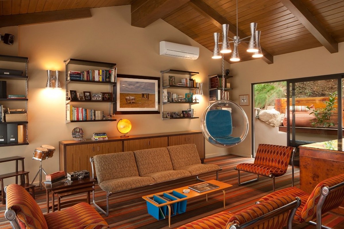
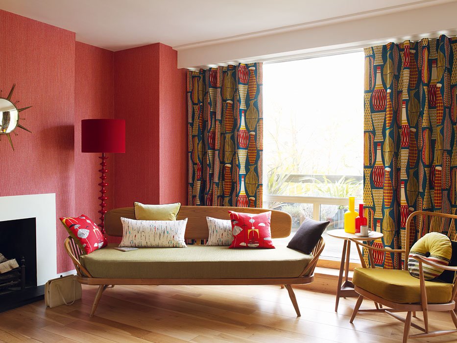
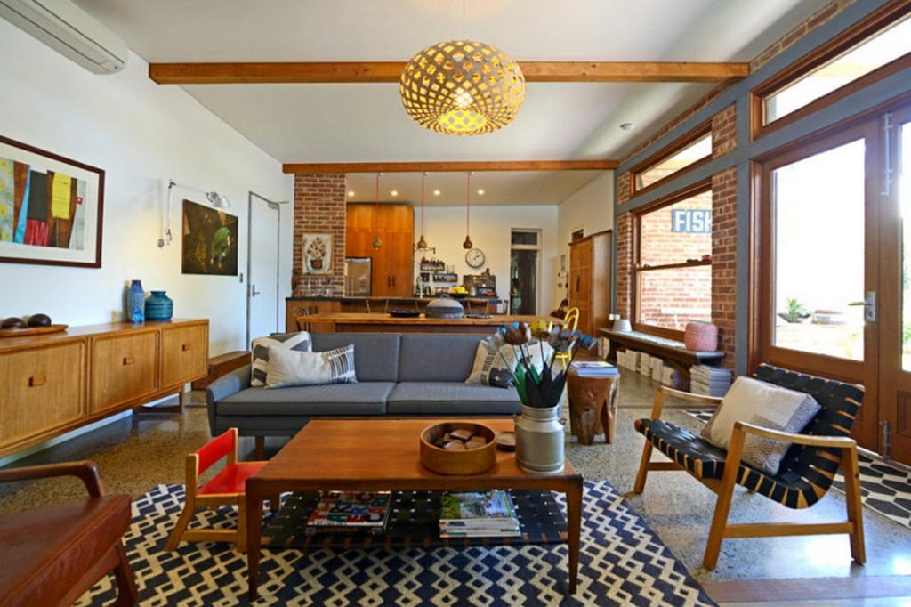
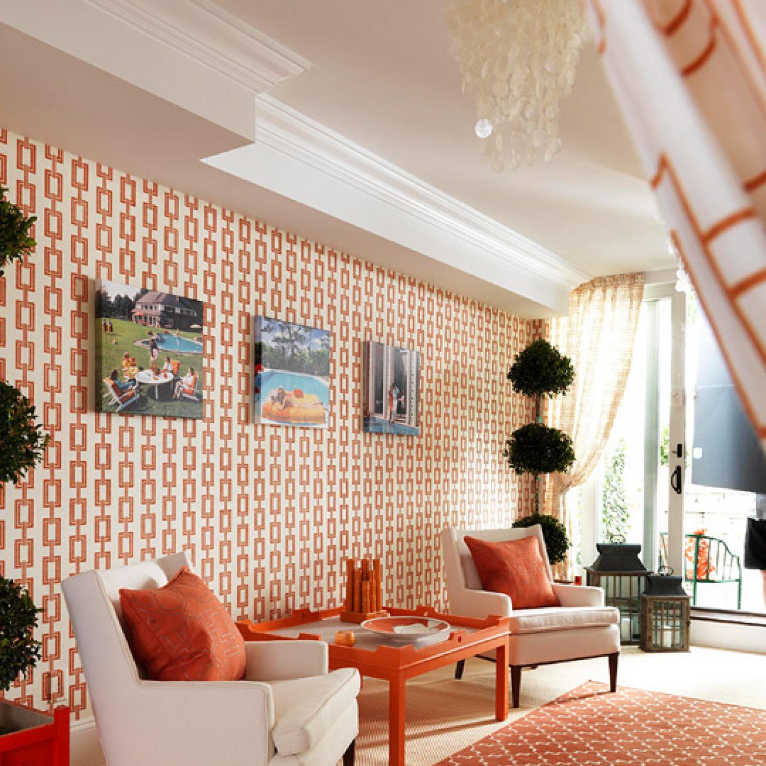
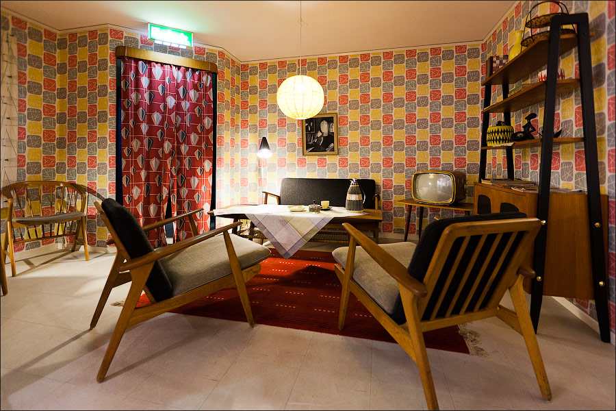
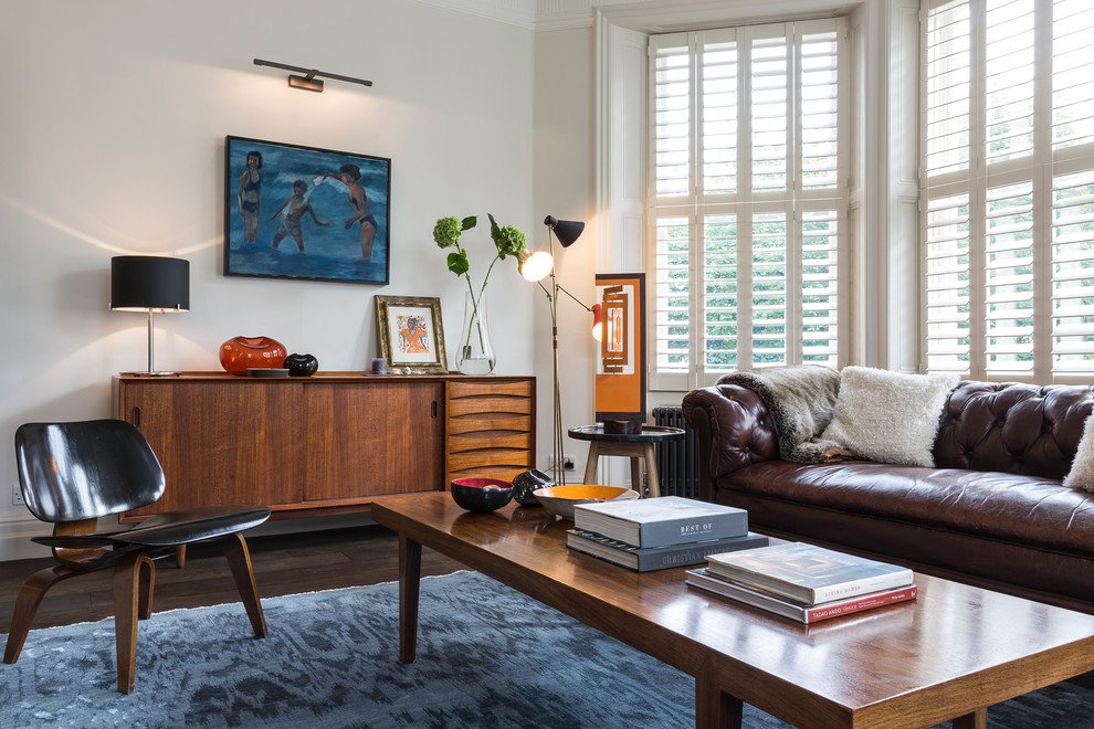
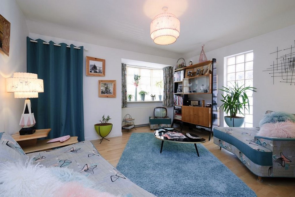
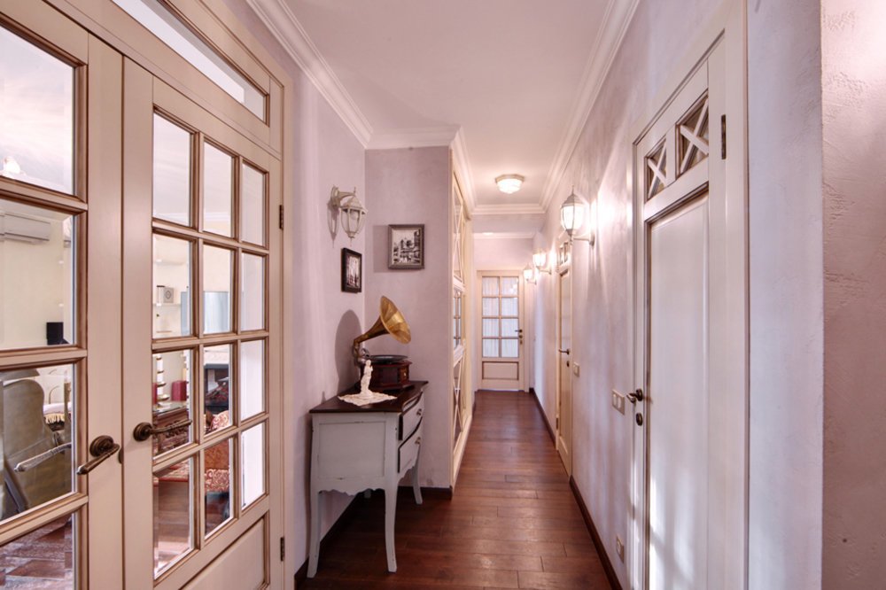
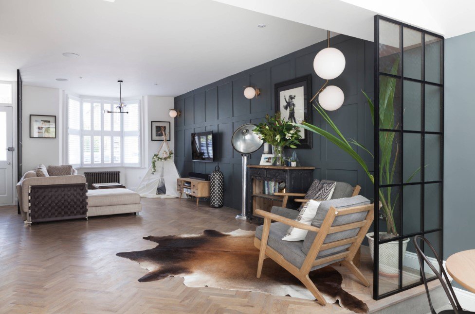
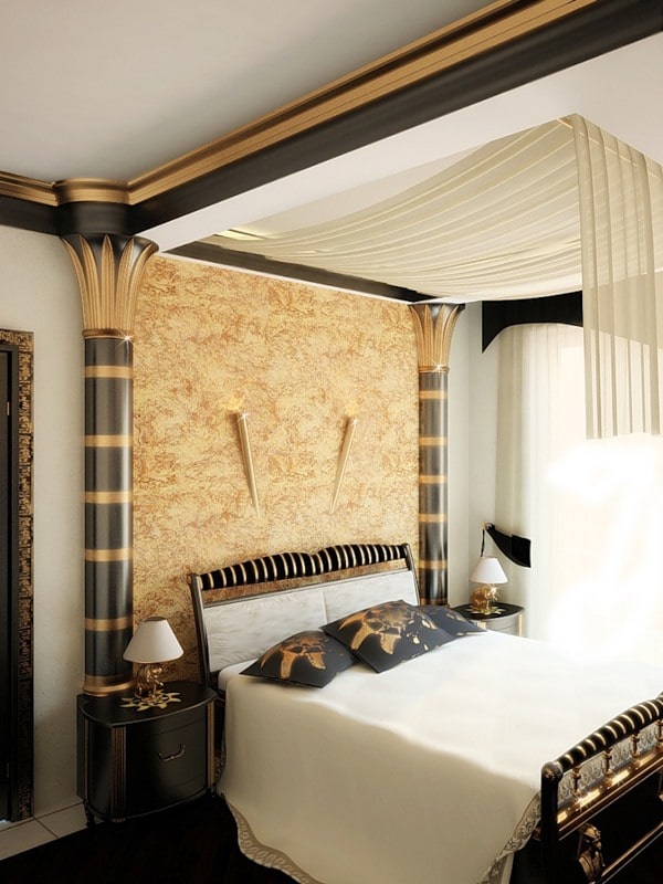
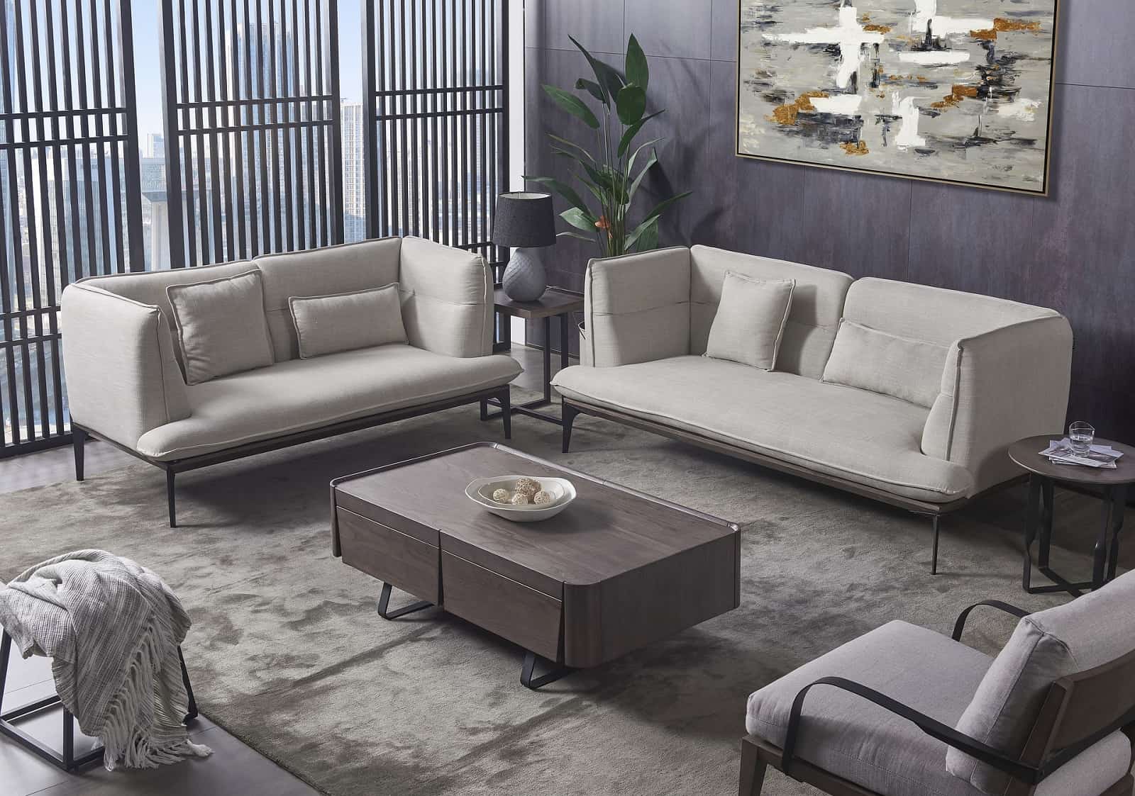
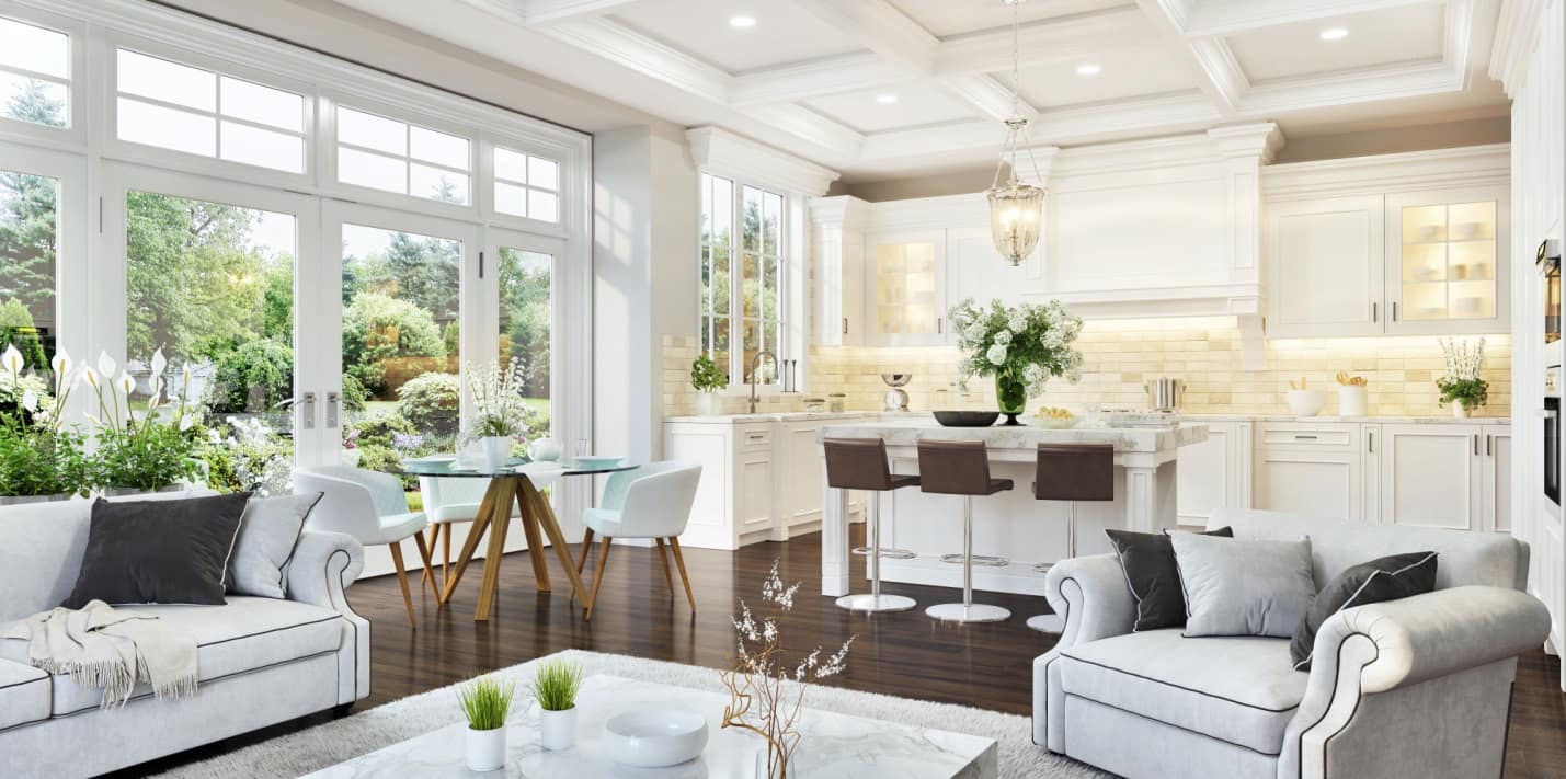
The twenty-first century is already long past the courtyard, but some living quarters still contain apartments where time seems to have stopped fifty years ago. There is still a lot of controversy about that era – some designers consider it tasteless, chaotic, uncomfortable for life. This is the heyday of the subculture of punks and hippies, disco music, and the emergence of color televisions. The interior design ideas in the style of the 1970s are becoming popular again, practically winning a leading position in some countries. View more about how to take interior photography that will look luxurious and realistic.
Contents
- Features, Style Characteristics
- Bright Colors, Accents
- Materials, Finishing
- Features in Choosing Furniture
- Abundant Use of Textiles
- Retro Lighting
- Example of Designing a Modern Apartment:
- Conclusion
Features, Characteristic of the Style
If today in the countries of the former USSR, people strive for high-tech, minimalist interiors, then in Europe and the US people predominantly appreciate finishing “of the nostalgic old times”. Old, but still strong, beautiful furniture of that era, is considered fashionable, expensive. This style is especially popular in the USA, under the name of retro.
This style is rich and bold, bright and elegant, combining charm and kitsch. When recreating this design at home, it is important not to “overdo it” with the decor, accessories. The interior should not look vulgar, excessive, prevent relaxing, but at the same time be recognizable. In this era, interiors are no longer standard, they begin to personalize, adapt to a particular person, his hobbies, and interests.
High technology in the design of the house became popular around this time – a lot of household appliances, very different from modern ones, appear in the interiors. These are small round-shaped refrigerators and large coarse microwaves, voluminous plastic food processors and heavy vacuum cleaners, huge computers with a small screen, and even larger reel tape recorders, washing machines that look like a spaceship and radio on wooden legs.
Bright Colors, Accents
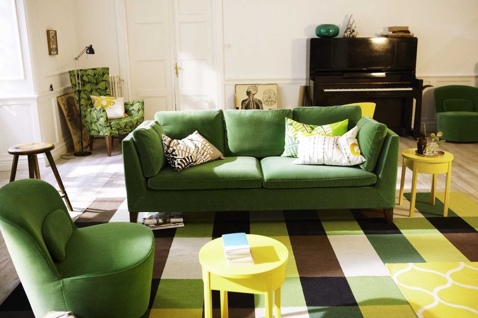
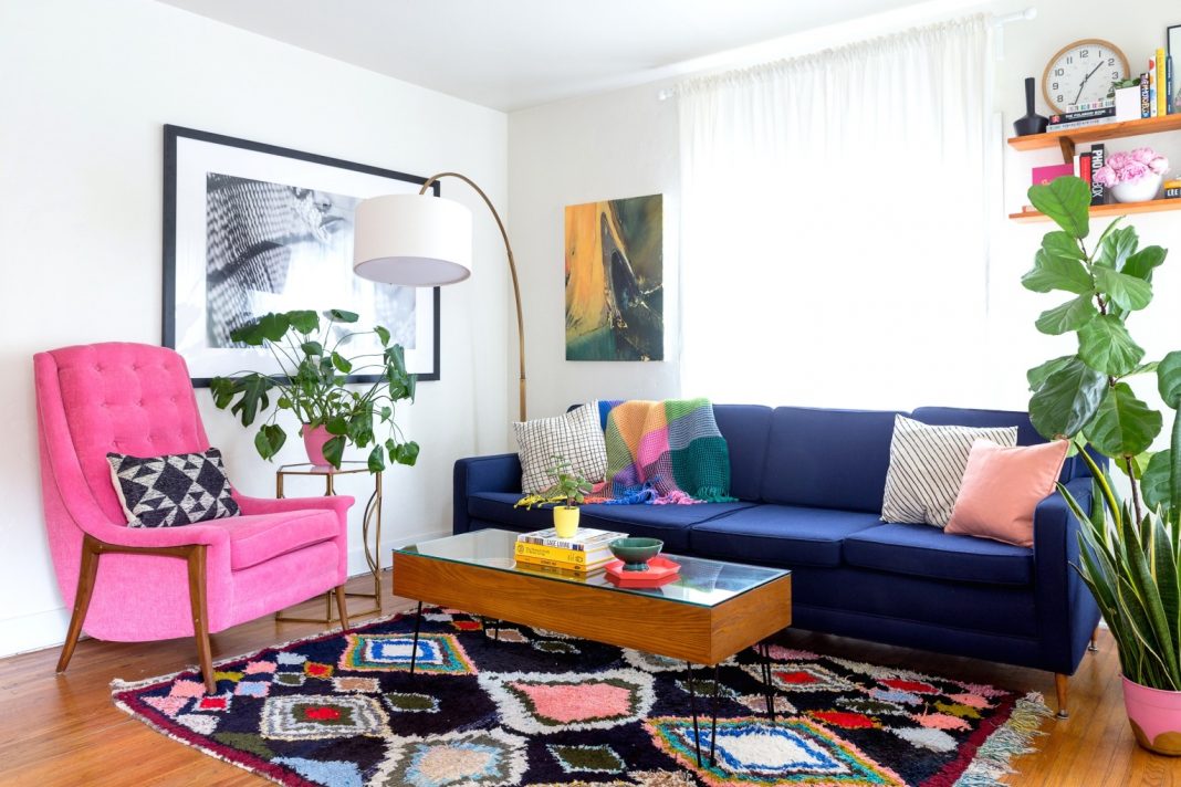
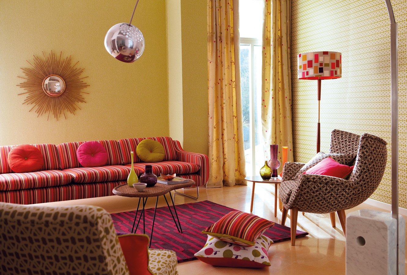
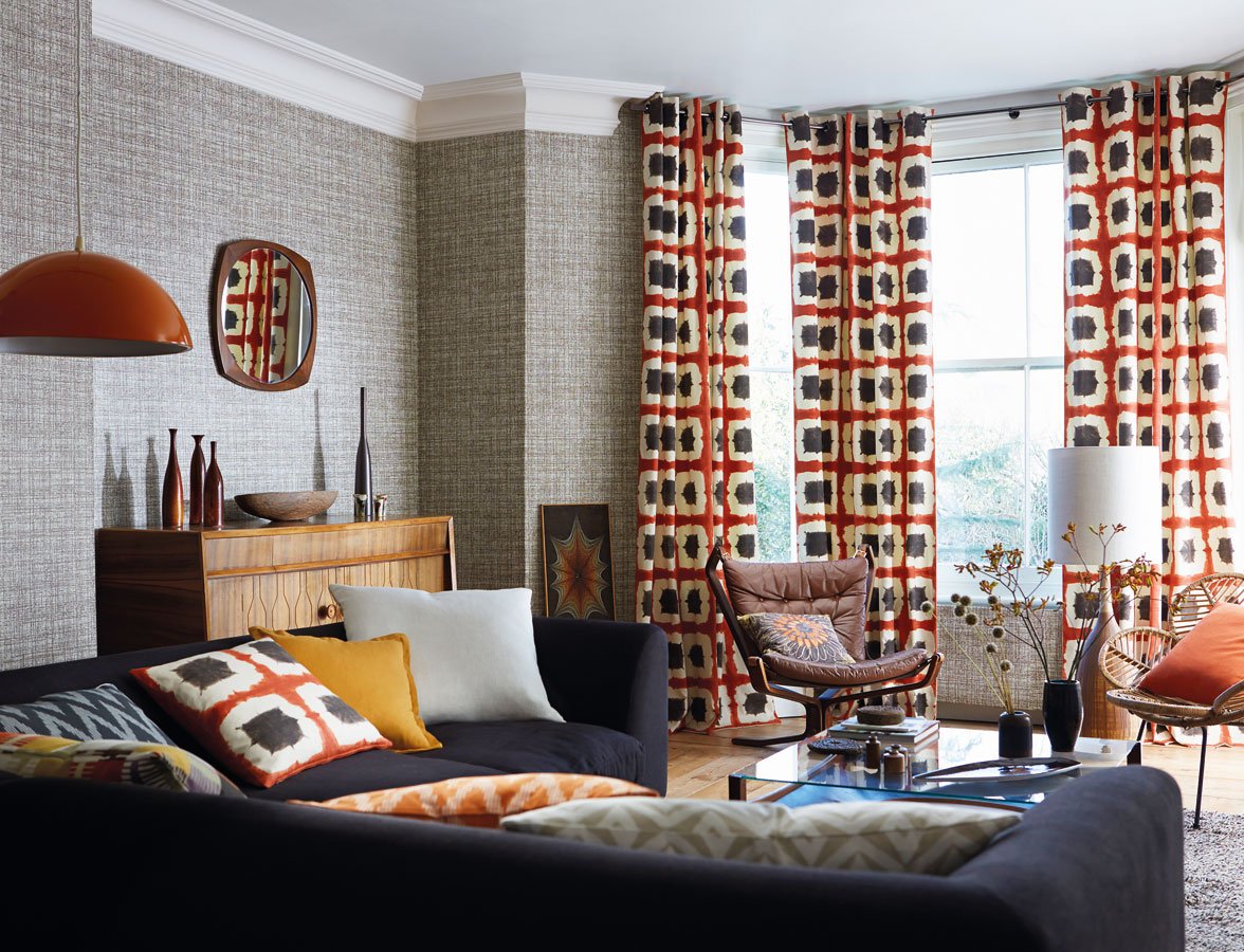
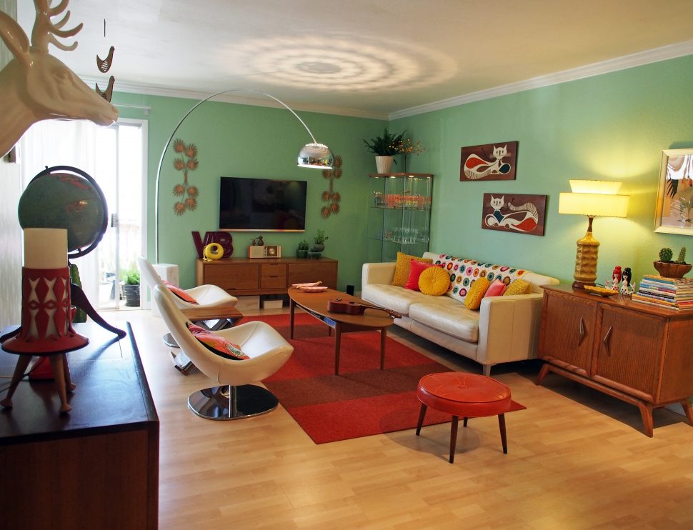
Regarding the color palette, the style of the 70s reminds us of Boho – there are practically no restrictions on the choice of colors. There are many natural, rainbow colors, acid colors. Light tones are selected for close rooms and the dark for spacious rooms. When the windows face south, the colors should be cold. If it faces the north – colors are warm.
The most interesting combinations are:
- sky blue with acid green;
- pebble with coral;
- strawberry with iron-gray;
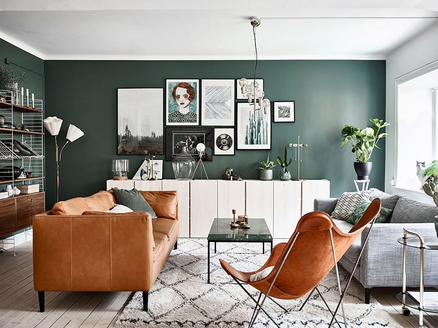
- brown with bottle green;
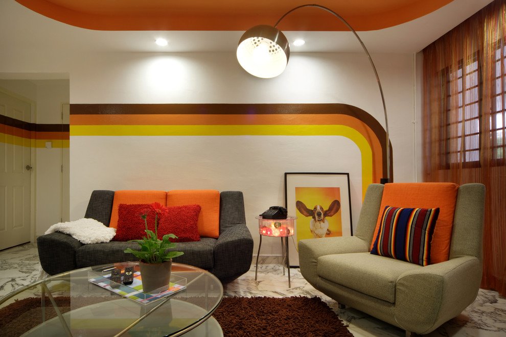
- pumpkin orange with sunny yellow;
- golden with purple;
- woody brown with pink;
- beige with purple-black;
- mustard with jeans;
- snow white with scarlet;
- cherry with cornflower;
- willow with orange.
As the main ones, the interior of the 70s will be decorated with a maximum of two or three colors, but here many small color accents are allowed to help withstand a clear style.
Materials, finishing
Finishing materials are very diverse:
- metal;
- wood;
- DSP;
- plastic;
- glass;
- plywood;
- leather;
- stone;
- vinyl;
- paint;
- wallpaper
The floor is decorated with a board, parquet flooring, which is made of oak, beech, elm, walnut, larch, birch, juniper, maple, pear, ash, and other species. Laminate which is imitating quality natural wood, “chessboard” linoleum, fiberboard, covered with red-brown paint is less commonly used.
The walls are also finished with wood (wainscoting), painted with paint, mostly brown, gray-golden, and covered with wallpaper with a geometric or floral pattern, “rich” texture. The ceiling is usually whitewashed, stretched, but qualitatively imitating whitewash, made of drywall, painted white. The use of stucco ceiling decoration is acceptable, but not too replete.
The doors here are usually high, almost up to the ceiling. In some apartments, there are also double doors, painted in white-blue, silver-gray, violet tones. The windows are mostly wooden, painted white.
The most commonly used “herringbone” parquet which is varnished or painted with translucent paint.
Features in the Choice of Furniture
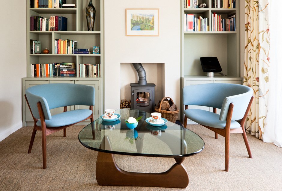
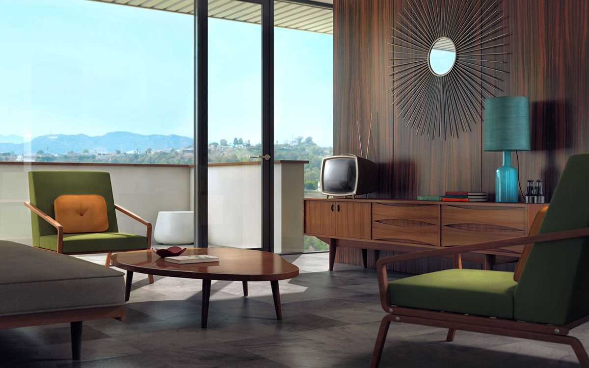
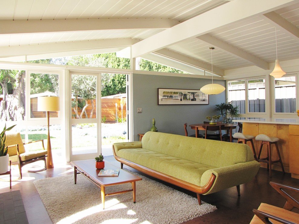
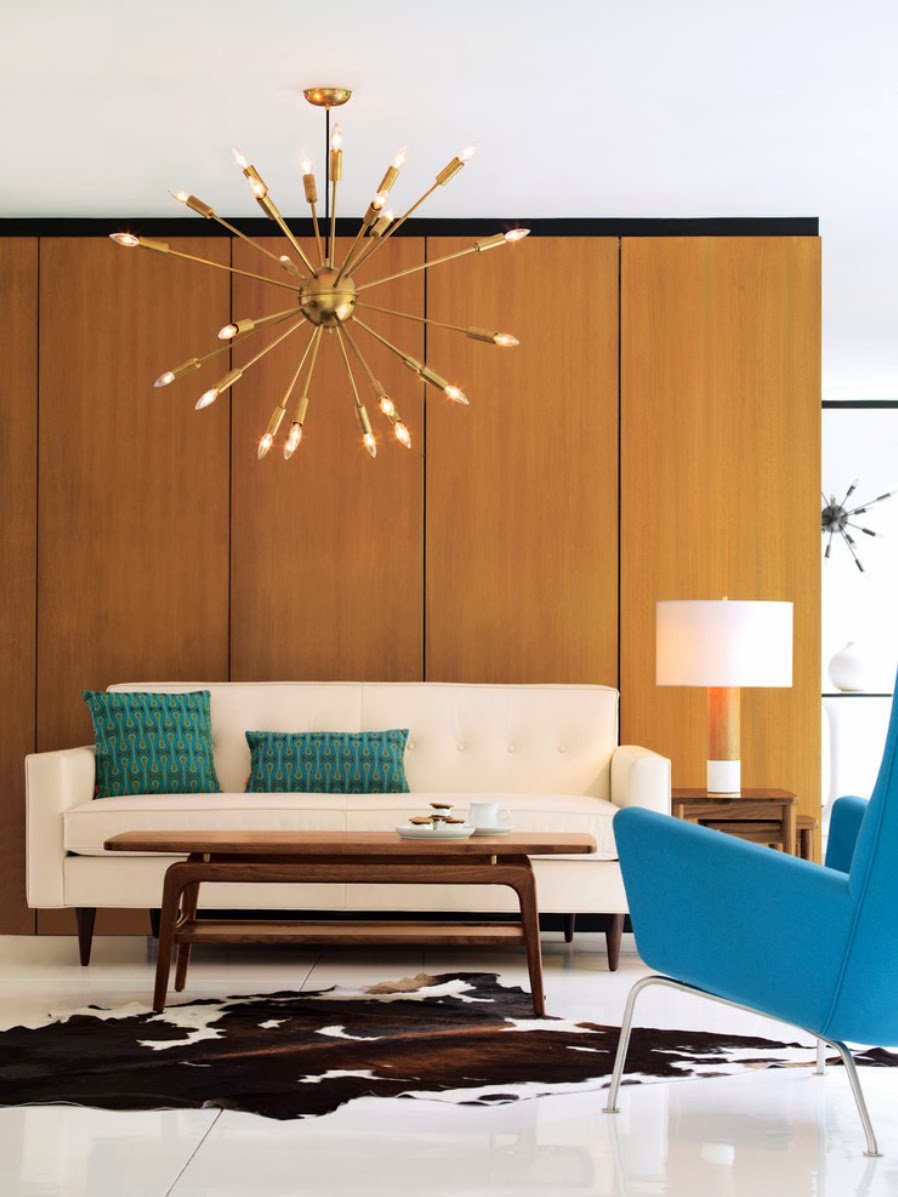
The furnishings are streamlined, overly glossy, and somewhat surreal. Asymmetrical forms are welcome. Among the materials for furniture, the wood of bog oak, chipboard, bronze, brass fittings, decorative elements of plastic are most usable; and also wicker furniture is allowed. Preference is given to upholstered furniture – cozy sofas, bent-glued armchairs, chairs with soft seats, and carved backs. The upholstery is chosen predominantly bright, but the more “solid” is also acceptable (graphite gray, chocolate brown).
In the 70s, brightly colored plastic (polypropylene) first appeared in the interiors. Round dining tables with chairs, children’s furniture, original shelves for indoor flowers were made from it. Such furniture is very elegant, comfortable.
Abundant Use of Textiles
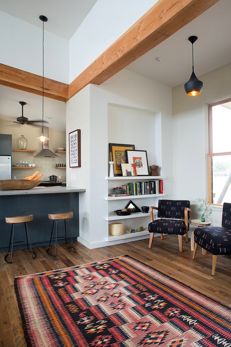
Carpets are widely used in the seventies as they are luxurious, fluffy, covering almost the entire floor and up to 40% of the surface of the walls. Floor mats are decorated with variegated intricate patterns, and wall covering ones, some of which are tapestries, with plot drawings depicting fantastic animals. A “walkway” is placed in the corridor with stripes along the edges. In the kitchen, on the balcony, and in the bathroom, there are also various “doormats”.
A spiny checkered plaid is an indispensable attribute of a cool vintage flat. Curtains are also thick, almost to the floor, protecting from cold and daylight. All textiles are executed in different colors, but with a similar pattern and texture. It uses fur, velvet, velour, natural wool, leatherette. Lots of multi-colored pillows, capes with fringe, tassels on the upholstered furniture, numerous lace tablecloths, napkins on all horizontal surfaces are also allowed. The walls are decorated with textile panels. Home-made wicker pots with live plants in flowerpots are placed on the windows.
Textiles, preserved from Soviet/Nixon-Carter times, will be able to decorate a modern interior only if it looks flawless.
Retro Lighting
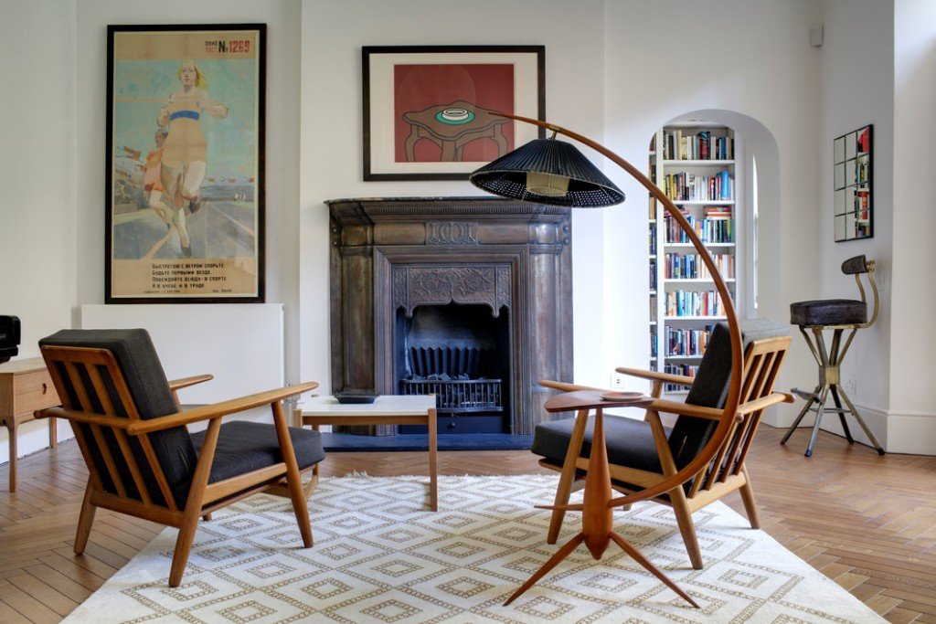
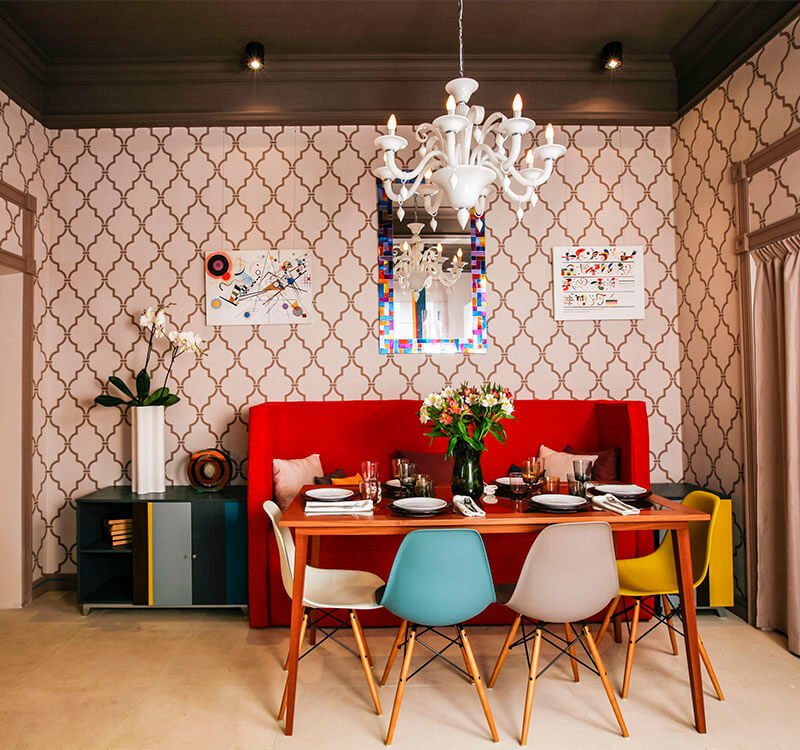
The lighting is usually plain, but the fixtures themselves look luxurious as they are predominantly crystal, multi-deck pseudo-crystal, multi-tiered chandeliers, tall floor lamps with fabric shades on turned legs, intricate sconces. Small decorative lamps of surrealistic form – lava-lamps and plasma-lamps adjoin them. Workplaces in the kitchen, in the office, in the nursery, are brightly lit with lamps on a long flexible leg with a shiny metal shade.
If desired, any original lighting fixture can have a shade made using a custom macrame or lace knit – you just need a suitable wireframe.
Example of the Design in Modern Apartment
Modern time suggests other interior priorities than 50 years ago. No one would guess to cover a flat TV with a white lace napkin now, and it is unlikely to allocate a whole room for a library because any book can be easily downloaded from the Internet. There were almost no closet-dressing rooms since not many people could afford a lot of clothes. Because the interior of those times was quite minimalist – it was easier to maintain cleanliness in it.
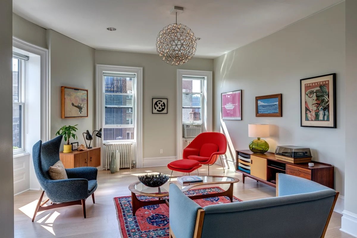
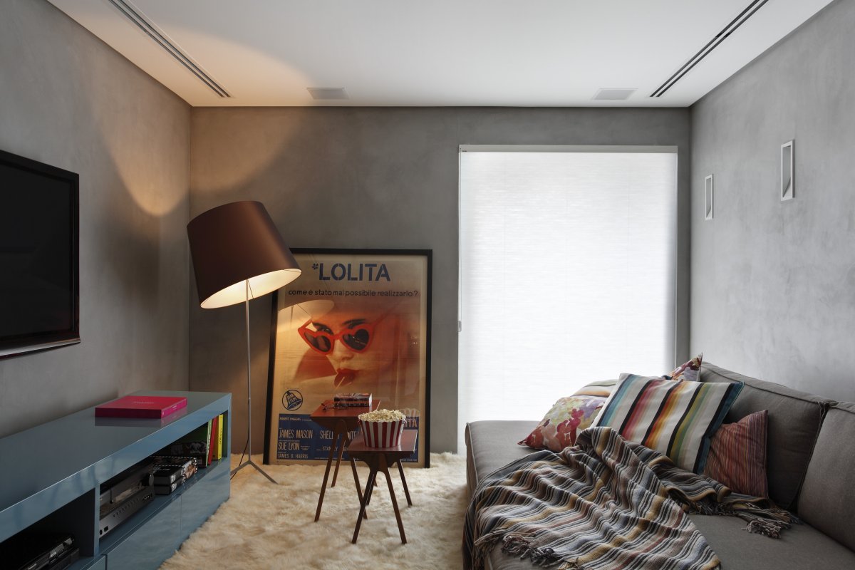
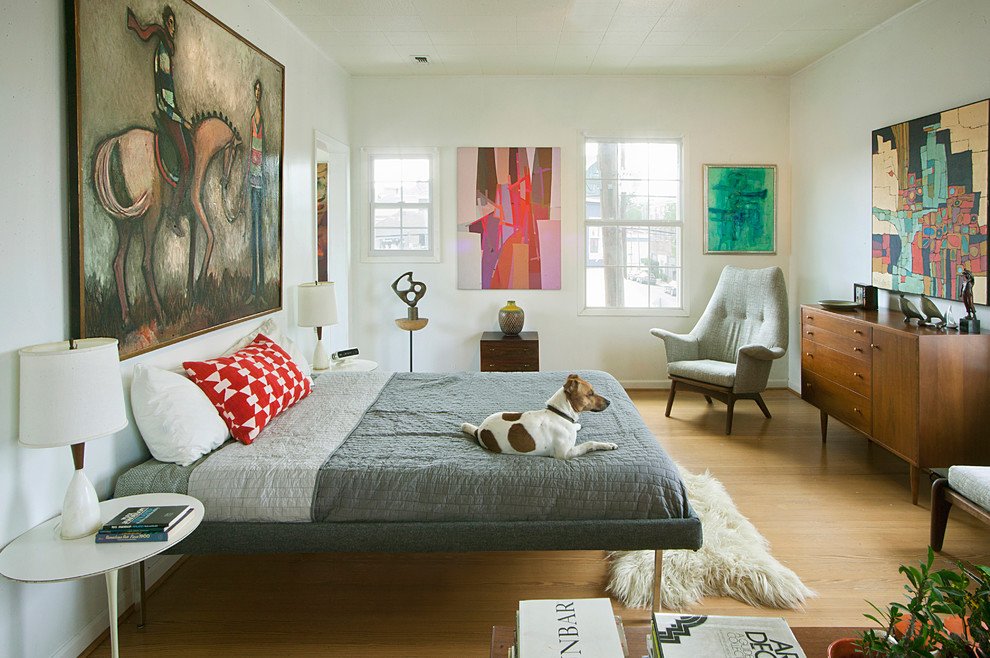
The decor here is quite variegated: from paintings, abstractions in a rectangular frame to colorful posters with movie stars of the 70s.
Hallway
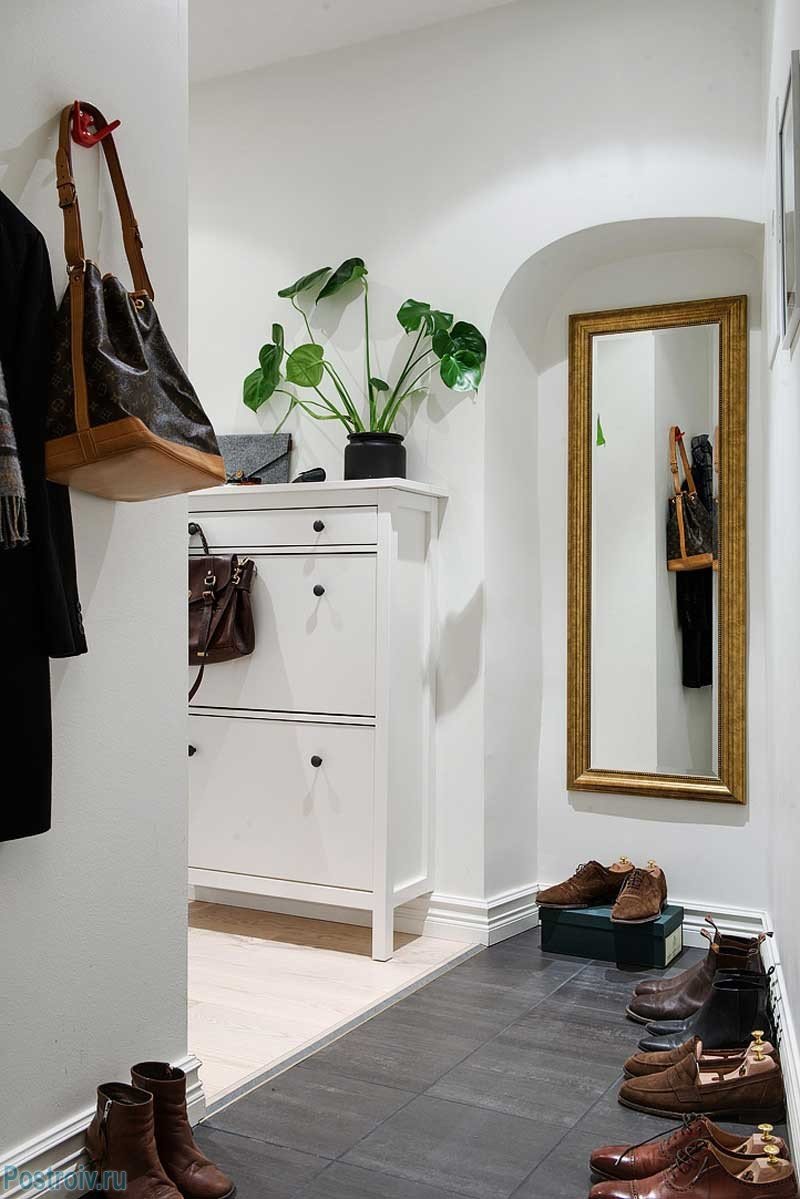
Trellis is often placed in the hall. It consists of a large mirror with three doors attached to a peculiar dressing table. It is relatively roomy, but most often takes up a lot of space. If the room is too cramped, instead of a trill, a regular mirror is mounted on the wall in a plain wooden frame, preferably of a dark color.
If you have a home phone, it is chosen of original form – rounded from bright plastic in acid colors or in a metal case. It is put on a special miniature shelf, located near the mirror. For outerwear, there is a wooden hanger. And hats, scarves, umbrellas are hung on real deer horns, covered with varnish.
Living Room
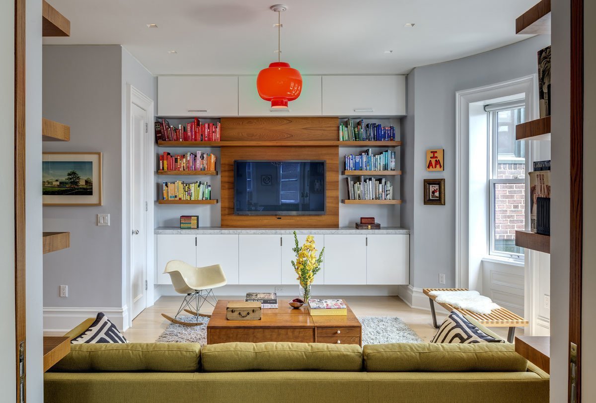
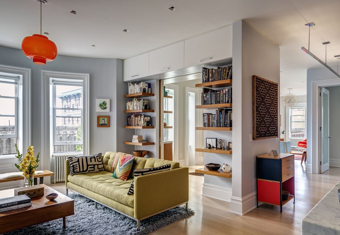
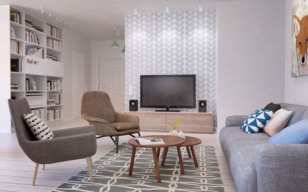
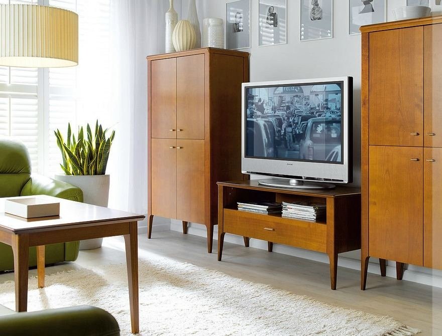
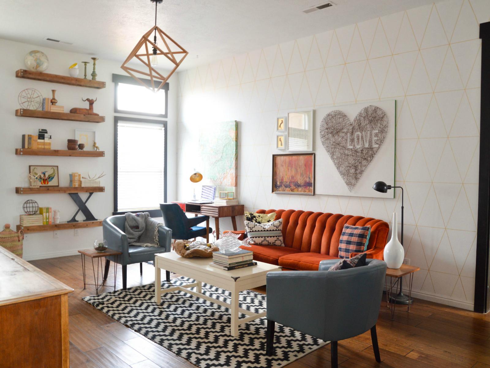
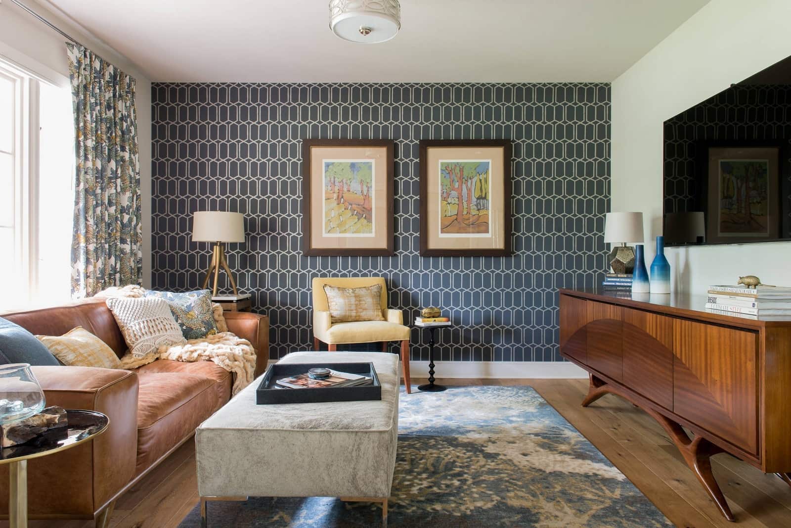
In almost 100% of cases, there was a closet-wall in the living room. It got the name for the simple reason that this item occupied an entire long wall. Almost everything was stored in it – a huge number of books, since everybody read books then; elegant dishes, taken a couple of times a year on holidays, individual items of clothing, small household appliances. For a modern interior, a more capacious “wall” furniture set is selected. TV is placed on the shelf in the middle of this set. If there are some books, only the most beautiful ones in bright covers are left in sight, picking them up in height. There also retain some of the dishes on the glazed shelves, but not all of them as they overly clutter up space.
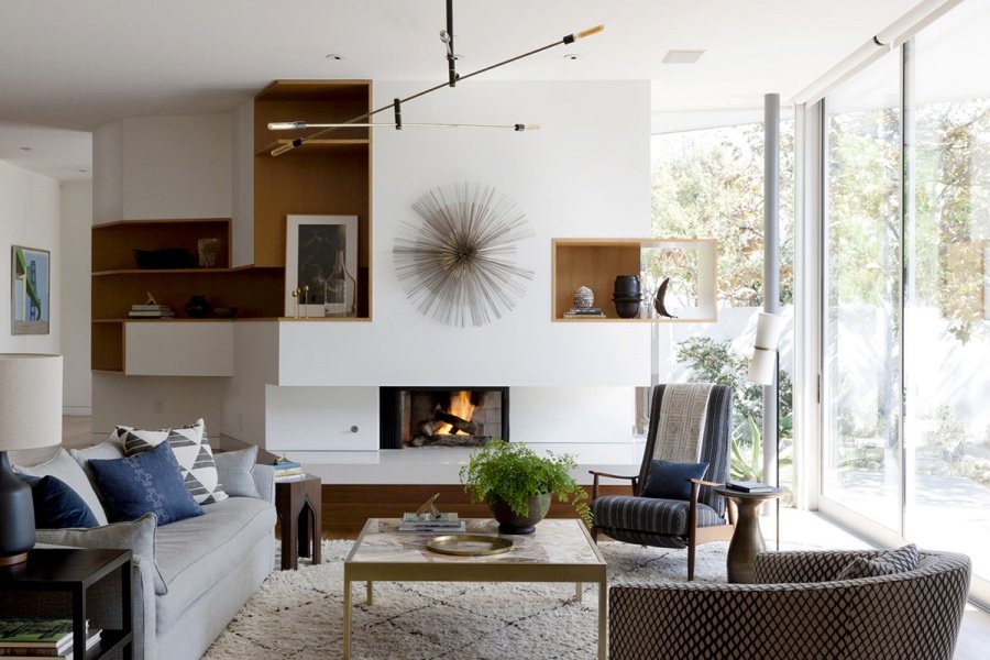
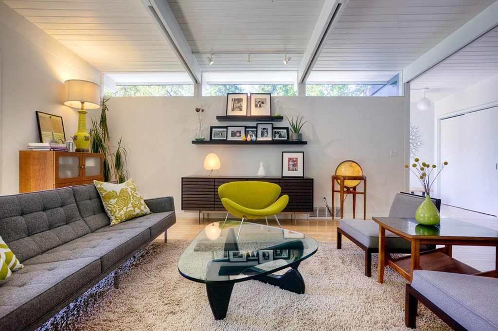
Opposite the wall, a soft sofa (usually folding), two “Scandinavian” armchairs with legs are located. Almost in the center, there is a coffee table with castors or on four cone-shaped legs. A real piano is neatly placed in the corner. Nowadays a small podium is made for it. If necessary, zoning is done with the help of curtains, folding screens. A geographical map or a real globe applied as decor.
Sometimes shelves are arranged all the way to the ceiling and a small study with a desk separates the shelves with books instead of a “wall-set”.
Kitchen
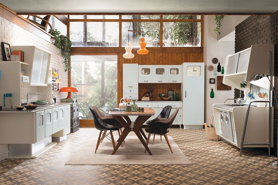
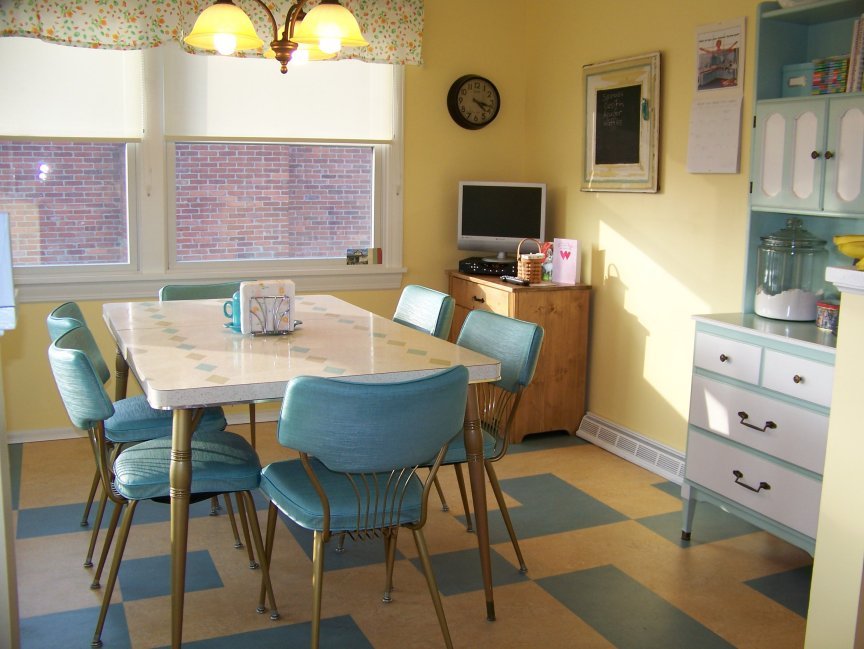
An indispensable object in the kitchen of the 70s is a sideboard. It was painted with white or bright paint, contained the minimal set of dishes, table linen. The kitchen set is white, blue, rarer – red, purple. It has a clear geometric shape, no roundness, and rough metal decor.
The dining table is decorated with a checkered or colorful oilcloth tablecloth, and around fringed chandelier lights it up. The table is often made folding, in the form of “book” – it could be enlarged in case of the arrival of guests. The dining area is decorated with a series of narrow shelves with intrinsic decor arranged on them – painted dishes, knitted dolls, and bright jars with spices.
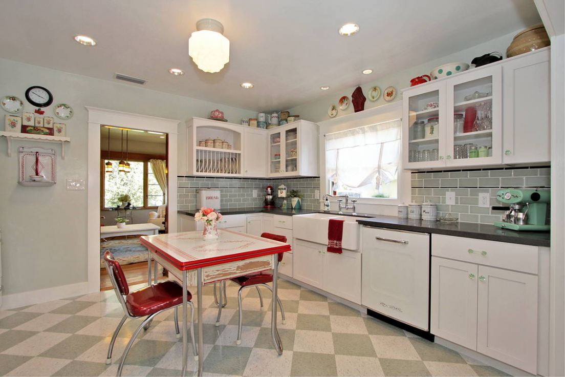
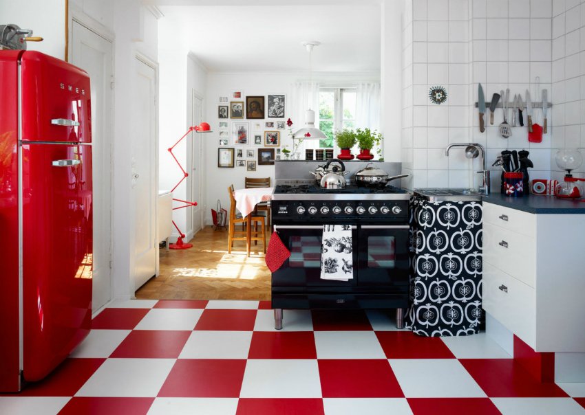
A large ceramic tile or linoleum with a black and white, black and green “chess” is placed on the floor. The walls are painted with light paint; the backsplash is laid out with small colored tiles.
Kitchen appliances are chosen of “antique” style – rounded shapes with massive iron handles. It should not be much at sight – everything superfluous, ultra-modern is hiding behind the doors of the facades.
The Bedroom
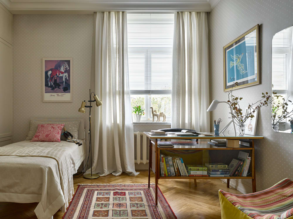
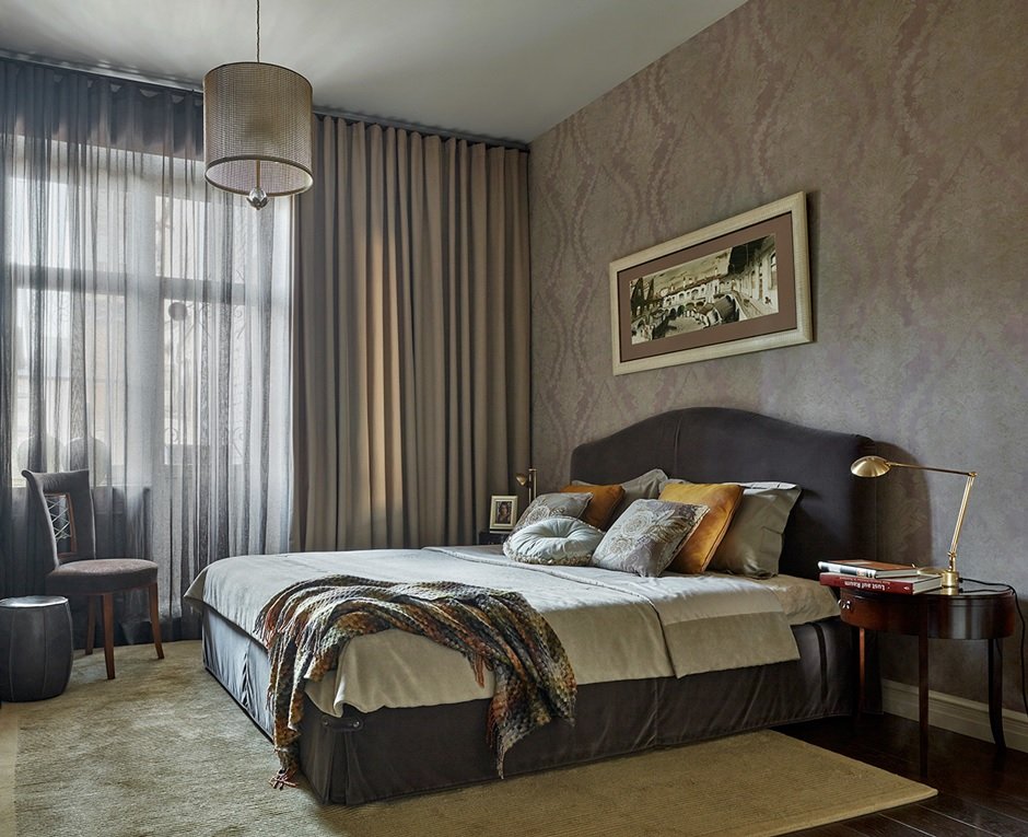
The bedroom will have a bed with a bedside table. Then this item was placed sideways to the wall. The wall lamp with a frosted glass canopy is hung above the bed. Instead of a full bed, a small sofa that will play the role of a place for sitting will be located in small bedrooms, and at night it will be folded out for sleeping. Bedding is chosen exclusively light, monophonic, or with stripes, openwork embroidery in some parts.
In the dressing area, they put a two-three-door wardrobe with polished doors, where you can store the outerwear on the bar on one side, bedding, and underwear – on the other. Sometimes a wooden floor hanger is installed next to it. A shelf of wood and metal wire is hung on one of the walls. Books, potted plants, home-made toys, and black and white photographs are placed on it.
The Bathroom
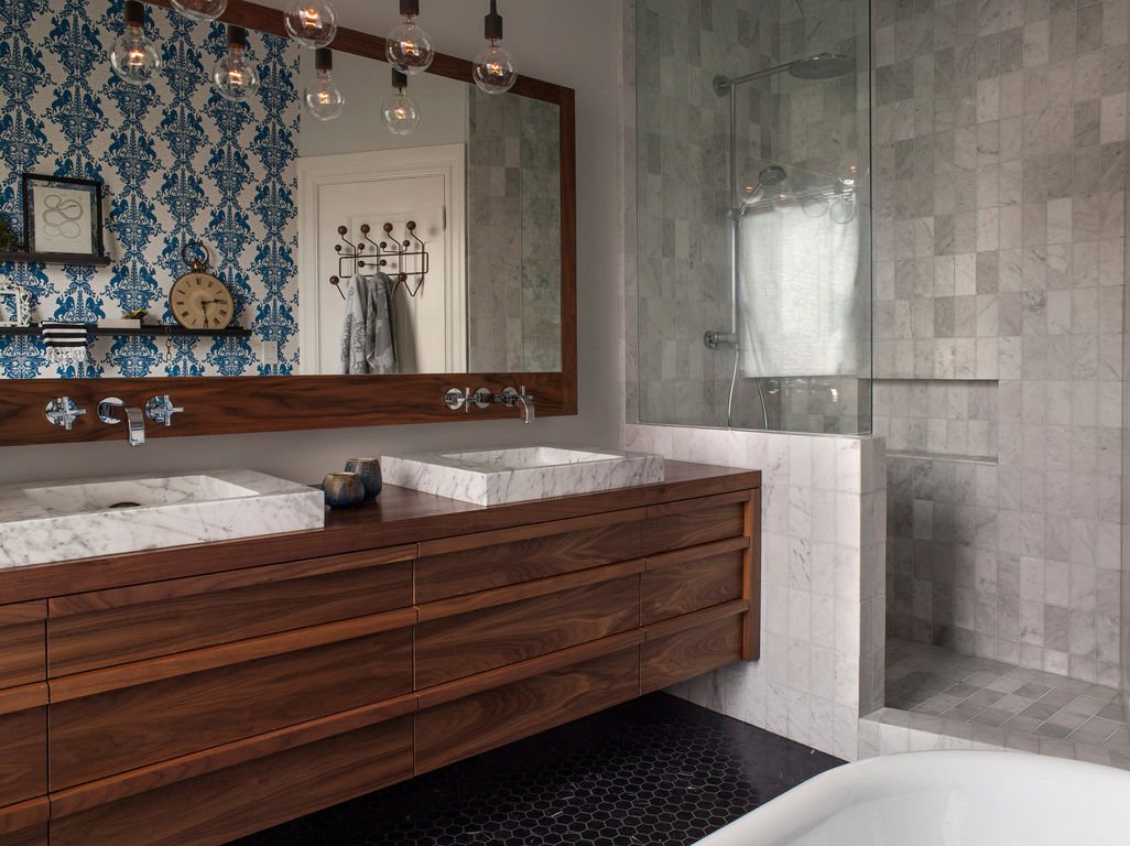
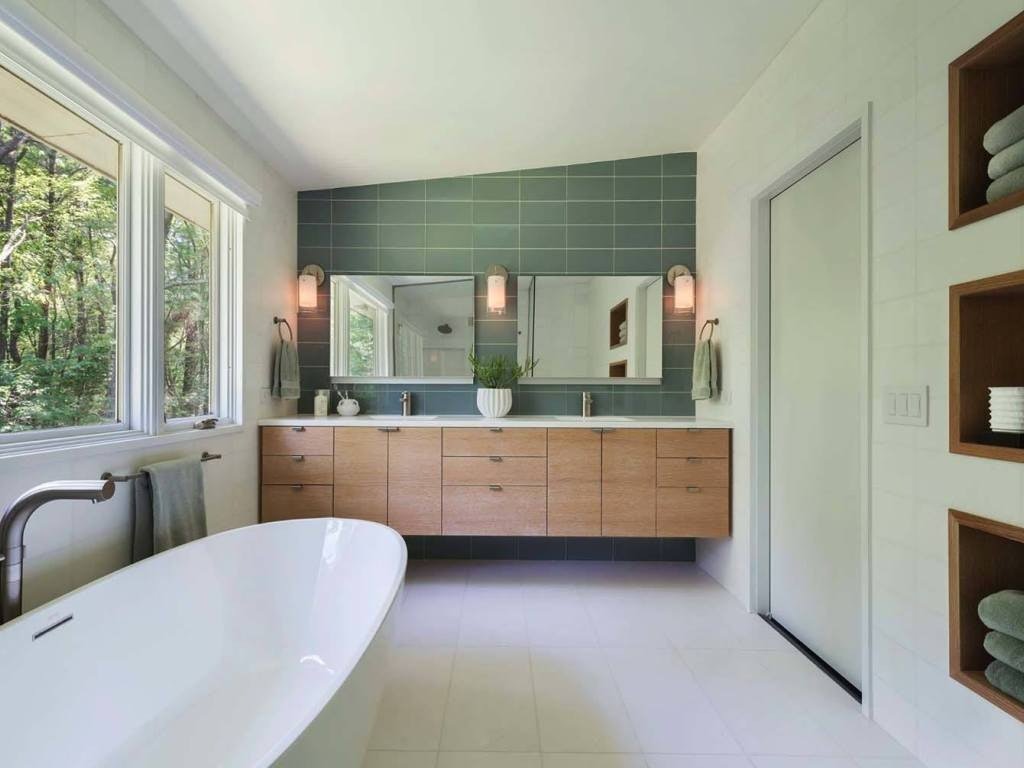
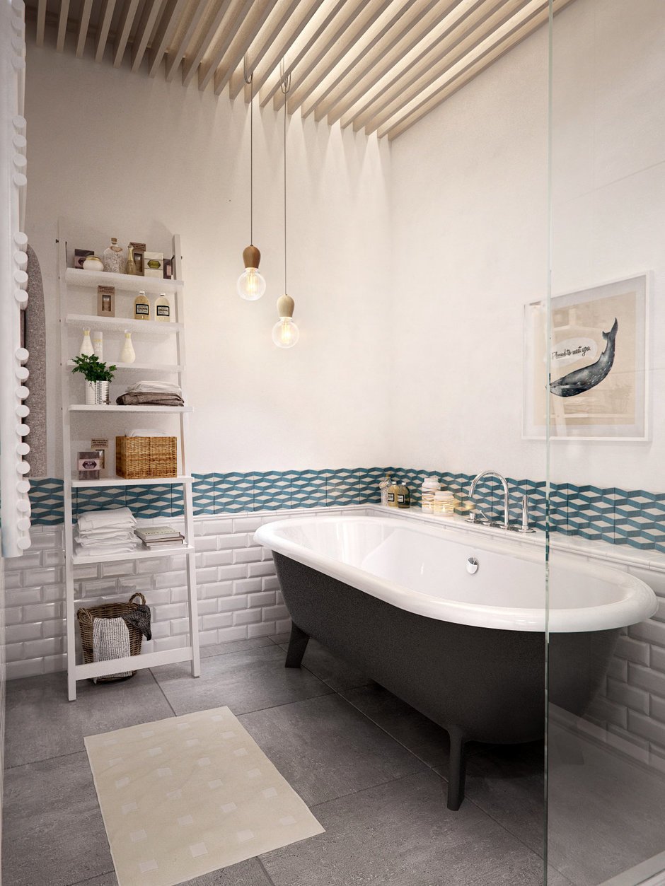
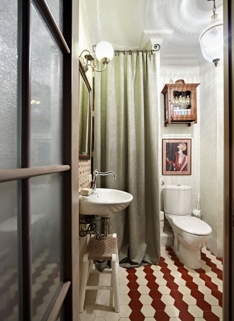
The bathroom was often combined with a toilet. The walls here are made of white monochromatic tiles or having a geometric pattern. The floor is also tiled, but darker. All plumbing fixtures are made white, although if desired, you can order a yellow-brown one that is artificially aged. The bath itself has brass, copper legs, and the tap of the same material.
There is nothing superfluous here – if there is free space, a dressing table-dresser with a mirror is placed, closed shelves are under the bathroom, there is almost no decor.
Conclusion
A full seventies-style interior design is completely uncomplicated, inexpensive if it is decided to recreate it in an old apartment built in the middle of the last century. Besides, having still not quite dilapidated furniture inherited from the grandmother. Those who wish sometimes develop something similar in modern condos or country houses will pay more as high-quality styling will be more expensive. “Antique” furniture, if desired, can be ordered from a master cabinetmaker.

